Archive
Application for Extracting and Exploring Analysis Ready Samples (AρρEEARS)
Imagine a data site where you can upload your own data for processing and spatial analysis, using tools that you do not own! The Application for Extracting and Exploring Analysis Ready Samples (AρρEEARS) allows you to do just that. I recently attended a presentation about this application at the Applied Geography Conference on AppEEARS and was very impressed. AppEEARS offers a simple, efficient way to access and transform geospatial data from a variety of federal data archives, and hence merits highlighting in this Spatial Reserves data blog. AppEEARS enables data users to subset and extract geospatial datasets using spatial, temporal, and band/layer parameters.
Two types of sample requests are available: point samples for geographic coordinates and area samples for spatial areas via vector polygons. Results stay on the LP DAAC site for 30 days, during which time you can archive them somewhere else or download them to your own device or server.
You need to have an Earthdata free account to use the site, but once you get one here, you can be off and running. AppEEARS is tied to the LP DAAC (Land Processes Distributed Active Archive Center), in which there is no shortage of data. Sample requests submitted to AρρEEARS provide users not only with data values, but also associated quality data values. Interactive visualizations with summary statistics are provided for each sample within the application, which allow users to preview and interact with their samples before downloading their data.
What’s more, you can also access the AρρEEARS API. This API allows users to write programs to interact with AρρEEARS. This is largely the same API that powers the AρρEEARS user interface.
My favorite part of AppEEARS is the tutorials and lessons that are in the e-learning resources zone, here. Presentations, videos, and webinars are housed there, but my favorite part is the tutorials. These are detailed, clear, and can be used as self-contained lessons for you, your colleagues, or students to learn about analysis methods, spatial data, and earth phenomena such as wildfires. For example, using a tutorial written by Danielle Golon from Innovate Inc (a USGS contractor), you can generate remote sensing-derived environmental descriptors to monitor Yosemite National Park, without downloading the remotely sensed data itself: All of your processing is done on the AppEEARS site, and you will use imagery, box plots, whisker plots of NDVI values, and other tools and data to analyze several fires from 2013 to 2018 over space and time. You will use NASA Visible Infrared Imaging Radiometer Suite data (VIIRS) and MODIS data (Moderate Resolution Imaging Spectroradiometer).
Using another tutorial, you will generate environmental descriptors of bus stops in the Phoenix metro area to determine which bus stops could benefit from heat relief shelters. This tutorial uses MODIS data and daily surface weather data.
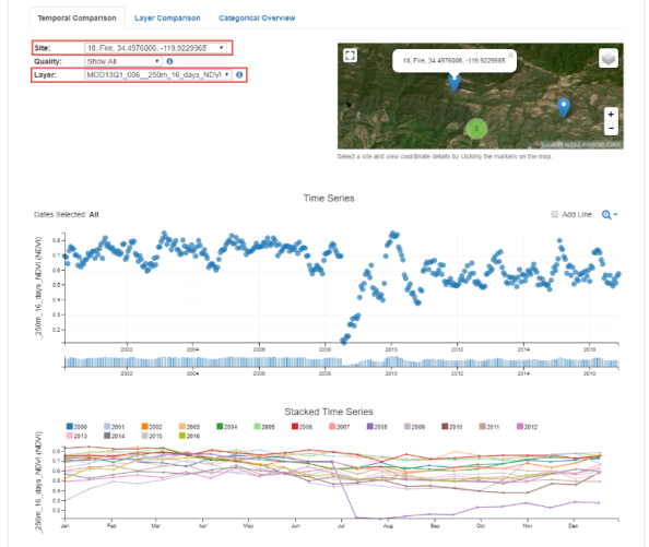
Sample AppEEARS temporal data for fire analysis.
I highly recommend giving the AppEEARS resources and tools a try.
–Joseph Kerski
The Good Ole Bad Days: Pixels, Scale and Appropriate Analysis
By Jim Smith, LANDFIRE Project Lead, The Nature Conservancy
Recently I saw a bumper sticker that said, “Just because you can doesn’t mean you should.” I couldn’t have said it better, especially regarding zooming in on spatial data.
Nowadays, (alert—grumble approaching), people zoom in tightly on their chosen landscape, region, and even pixel, whether the data support that kind of close-up view or not. Understandably, that means a LOT of misapplication of perfectly good science followed by head scratching and complaining.
To set a context, I want to look at the “good ole days” when people used less precise spatial data, but their sense of proportion was better. By “ole,” I mean before the mid-1980s or so, when almost all spatial data and spatial analyses were “analog,” i.e. Mylar map layers, hard copy remote sensing images and light tables (Ian McHarg’s revelation?). In 1978, pixels on satellite images were at least an acre in size. Digital aerial cameras and terrain-correct imagery barely existed. The output from an image processing system was a line printer “map” that used symbols for mapped categories, like “&” for Pine and “$” for Hardwood (yes, smarty pants, that was about all we could map from satellite imagery at that time). The power and true elegance we have at our finger tips today was unfathomable when I started working in this field barely 30 years ago.
Let me wax nostalgic a bit more – indulge me because I am an old GIS coot (relatively anyway). I remember command line ArcInfo, and when “INFO” was the actual relational data base used by ESRI software (did you ever wonder where the name ArcInfo came from?). I remember when ArcInfo came in modules like ArcEdit and ArcPlot, each with its own manual, which meant a total of about three feet of shelf space for the set. I remember when ArcInfo required a so-called “minicomputer” such as a DEC VAX or Data General, and when an IBM mainframe computer only had 512K [not MB or GB] RAM available. I know I sound like the clichéd dad telling the kids about how bad it was when he was growing up — carrying his brother on his back to school in knee-deep snow with no shoes and all that — but pay attention anyway, ‘cause dad knows a thing or two.
While I have no desire to go back to those days, there is one concept that I really wish we could resurrect. In the days of paper maps, Mylar overlays, and photographic film, spatial data had an inherent scale that was almost always known, and really could not be effectively ignored. Paper maps had printed scales — USGS quarter quads were 1:24,000 — one tiny millimeter on one of these maps (a slip of a pretty sharp pencil) represented 24 meters on the ground — almost as large as a pixel on a mid-scale satellite image today. Aerial photographs had scales, and the products derived from them inherited that scale. You knew it — there was not much you could do about it.
Today, if you care about scale, you have to investigate for hours or read almost unintelligible metadata (if available) to understand where the digital spatial data came from — that stuff you are zooming in on 10 or 100 times — and what their inherent scale is. I think that most, or at least many, data users have no idea that they should even be asking the question about appropriate use of scale — after all the results look beautiful, don’t they? This pesky question means that users often worry about how accurately categories were mapped without thinking for a New York minute about the data’s inherent scale, or about the implied scale of the analysis. I am especially frustrated with the “My Favorite Pixel Syndrome” when a user dismisses the entire dataset because it mis-maps the user’s favorite 30-meter location, even though the data were designed to be used at the watershed level or even larger geographies.
So, listen up: all that fancy-schmancy-looking data in your GIS actually has a scale. Remember this, kids, every time you nonchalantly zoom-in, or create a map product, or run any kind of spatial analysis. Believe an old codger.

The Good Ole Bad Days: Pixels, Scale and Appropriate Analysis.
—–
Authors: This week’s post is guest written from The Nature Conservancy’s Landfire team, which includes Kori Blankenship, Sarah Hagen, Randy Swaty, Kim Hall, Jeannie Patton, and Jim Smith. The Landfire team is focused on data, models, and tools developed to support applications, land management and planning for biodiversity conservation. If you would like to guest write for this Spatial Reserves blog about geospatial data, use the About the Authors section and contact one of us about your topic.
Spatial Analyst videos describe decision making with GIS
I have created a series of 22 new videos describe decision making with GIS, using public domain data. The videos, which use the ArcGIS Spatial Analyst extension, are listed and accessible in this YouTube playlist. Over 108 minutes of content is included, but in easy-to-understand short segments that are almost entirely comprised of demonstrations of the tools in real-world contexts. They make use of public domain data such as land cover, hydrography, roads, and a Digital Elevation Model.
The videos include the topics listed below. Videos 10 through 20 include a real-world scenario of selecting optimal sites for fire towers in the Loess Hills of eastern Nebraska, an exercise that Jill Clark and I included in the Esri Press book The GIS Guide to Public Domain Data and available online.

New Spatial Analyst videos explain how to make decisions with GIS.
1) Using the transparency and swipe tools with raster data.
2) Comparing and using topographic maps and satellite and aerial imagery stored locally to the same type of data in the ArcGIS Online cloud.
3) Analyzing land cover change with topographic maps and satellite imagery on your local computer and with ArcGIS Online.
4) Creating a shaded relief map using hillshade from a Digital Elevation Model (DEM).
5) Analyzing a Digital Elevation Model and a shaded relief map.
6) Creating contour lines from elevation data.
7) Creating a slope map from elevation data.
8) Creating an aspect (direction of slope) map from elevation data.
9) Creating symbolized contour lines using the Contour with Barriers tool.
10) Decision making using GIS: Introduction to the problem, and selecting hydrography features.
11) Decision making using GIS: Buffering hydrography features.
12) Decision making using GIS: Selecting and buffering road features.
13) Decision making using GIS: Selecting suitable slopes and elevations.
14) Decision making using GIS: Comparing Boolean And, Or, and Xor Operations.
15) Decision making using GIS: Selecting suitable land use.
16) Decision making using GIS: Selecting suitable land use, slope, and elevation.
17) Decision making using GIS: Intersecting vector layers of areas near hydrography and near roads.
18) Decision making using GIS: Converting raster to vector data.
19) Decision making using GIS: Final determination of optimal sites.
20) Creating layouts.
21) Additional considerations and tools in creating layouts.
22) Checking Extensions when using Spatial Analyst tools.
How might you be able to make use of these videos and the processes described in them in your instruction?
Contributors
Gallery


Recent Comments