In this avalanche of spatial data, it is more important than ever to encourage your users to fully understand the data they are using. Sometimes, stakeholders view anything on the computer as accurate and complete, including maps. Maps are incredibly useful, but inherently full of errors and distortions, from the map projection they are drawn from, to missing data, to generalized lines. Nowadays, anyone can make a digital map. Help your the users of your data understand that data quality affects subsequent analysis. For example, in a lesson I frequently teach on plate tectonics, I ask students to study 2001’s largest earthquake, below (south of) the tip of the arrow:
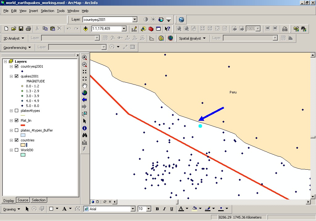
Using a measure tool, students determine that the earthquake is 4 kilometers off of the coast of Peru. But then I ask them to consider the fact that the generalized coastline was digitized at 1:30,000,000 scale. How confident are we based on this shoreline that the earthquake was offshore? Consider the classic geography problem of calculating the length of the British (or any) coastline—the more detailed the scale, the longer the coastline becomes, because at larger and larger scales, the coastline begins to include every cape and bay. Peru’s coastline may actually twist and turn here, so the earthquake could have occurred on the beach. The “so what” and spatial thinking discussion continues with the impacts of coastal earthquakes versus underwater quakes, and possible tsunamis.
Encourage your data users – whether they are students, customers, managers, the general public, or others – to be critical of spatial data—knowing its source, who produced it, when and why it was produced, the scale at which it was produced, and its content. Show them how to create and access metadata. They will then be able to critically evaluate spatial information and decide whether they will use it in their present and future decision making. And it is my hope that when they produce their own data, that they will tag and document it thoroughly.


Recent Comments