Archive
The Landsat Explorer Web Mapping Application, Revisited
In four years since we last wrote about what was then the “Landsat thematic bands application,” many features have been added to this tool. Furthermore, as it is, I believe, one of the very most useful mapping tools for research and instruction, ’tis time for an updated review. Now known as the Landsat Explorer app, this web mapping application is now part of the Living Atlas set of apps, a very useful set of tools that includes the Wayback imagery (which we have written about here), the water balance app, and others. I have used the Landsat Explorer app for research and also in a wide variety of instructional settings, from upper primary to university level, and in remote sending and GIS courses, but also in geography and environmental science courses. You could also use it for research purposes. With this app, Landsat images for the whole world are available to you at your fingertips, over a 45 year span of time. Truly amazing.
The Landsat Explorer app’s main tools are its renderer, identify, time-swipe-change, mask, save layer to ArcGIS Online, export, and add data from ArcGIS Online.
The renderer allows you to choose from about 10 band combinations, from agriculture to vegetation index to geology and more. This is incredibly responsive and useful. The only slight misgiving I have from an instructional standpoint is that I wish the band combinations would be visible, so students and others understand some of remote sensing theory. To the app’s credit, though, you can choose your own custom bands and indicate the band number you wish to display, shown below.

Identify allows you to learn the image scene ID, acquisition date, and cloud cover.
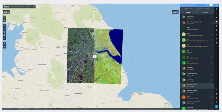
Most likely, most users will use this application for understanding change over time via imagery. You can use the swipe tool and the change detection tool for this. Before you can compute change, you will need to select Primary and Secondary Dates. Use the Time Slider to select an earlier date and click the Set as Secondary Layer button. Then, select a later date and move to the Swipe tool or the Change Detection tool to compare them. The Swipe tool for the Mt St Helens area for 1990 and 2019 are shown below. The swipe tool is my favorite but admittedly sometimes a frustrating tool to use, to get exactly the images you wish to have on the left and right side. It is also a bit confusing in the app to understand which image corresponds to which dates. All I can say here is to go through the very helpful tutorial, available on the lower left via the ‘graduation cap’ symbol, and carefully follow the steps.

The change detection tool can calculate changes in vegetation health (NDVI or SAVI), burned area (Burn Index), water content (Water Index), and urban area (Urban Index). Three items of interest: First, I am using the vegetation index, but you can use this drop-down to change to the soil adjusted vegetation index, the burn index, the water index, and the urban index. Second, the sliders can be used in your change detection. Third, you can define your own area of interest rather than take the default scene that is in your browser window.

Save allows you to save the top layer to your ArcGIS Online account (a log in to your own account is required). Export allows you to extract whatever map (the top layer in the app) you have built as a local file–a high resolution TIFF with customizable pixel sizes and spatial reference. This is a file that you can then bring into ArcGIS Pro or any GIS software for further analysis.
As the name implies, “Add data from ArcGIS Online” allows you to bring in your content from your own ArcGIS Online account into the Landsat viewer (a log in to your own account is required). After doing so, however, it wasn’t clear how to obtain a list of layers so I could turn my added layer off, so in my view this is the only tool I would probably would not use much. “Stories” shows a selection of 5 areas around the world where Landsat imagery is applied to solve real-world challenges, including in flood analysis. The “points of interest” choice here is particularly useful for instruction, guiding you to numerous places around the planet with explanations of each human-built and natural feature with a specific combination of Landsat bands.
Finally, if you wish to create your own similar type of app in the ArcGIS platform, go to the GitHub imagery zone and to the ArcGIS Developers site. Give this tool a try and I look forward to your comments.
–Joseph Kerski
Top 7 Satellite Imagery Sources
My colleagues at EOS.com recently wrote a summary of what they consider to be the top 7 satellite imagery sources: https://eos.com/blog/7-top-free-satellite-imagery-sources-in-2019/.
These include sources that we have reviewed on this Spatial Reserves blog, here: https://spatialreserves.wordpress.com/2019/02/18/the-top-10-most-useful-geospatial-data-portals-revisited/ as well as the top Landsat sites that we reviewed, here: https://spatialreserves.wordpress.com/2019/08/04/the-top-10-landsat-image-sites/, but it also includes a few we have not reviewed, such as EOS’ own Landviewer.
It is good to see reviewed collections such as these that have an aim to make life a bit easier for us as data consumers and analysts.
Landviewer data portal, from EOS.
–Joseph Kerski
Imagery: It is what it is: Well, not always.
Being critical of all data, including geospatial data, is a chief theme of this blog and our book: Use it wisely. Know where it came from. Know what has been done to it. Imagery has always been an important component of geospatial data, and today, it takes many forms, ranging from images taken on the ground with a phone or camera to those taken by webcams, UAVs, aircraft, satellites, and more. Doesn’t this imagery “tell it like it is” and is it therefore exempt from us casting a critical eye on it? I contend that no, images must be viewed critically so that you can determine if they are fit for your use in whatever project you are working on. For more, read below and see my video here.
As one example in a larger story, consider the example of the removal of individuals from 20th Century photographs in the USSR. But lest we think such image doctoring was a thing of the past, there are dozens of articles that arise in current web searches highlighting modern day image manipulation, from fashion magazines to science journals, some inadvertent, some on purpose, some for purposes to benefit society and some unfortunately to mislead. In the geospatial world, consider the image offsets on Google Maps in China that we wrote about not long ago.
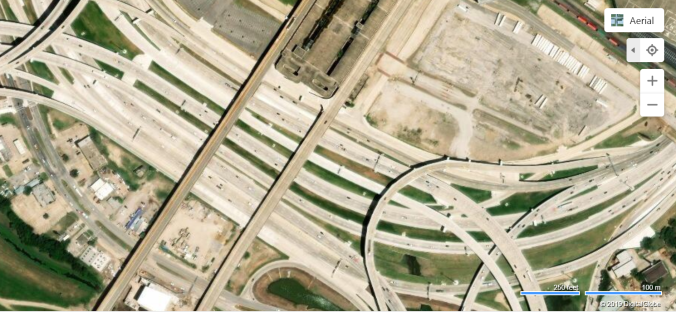
Let’s discuss another aspect of image manipulation. Consider the satellite images below. They cover many different dates and are derived from many different sources. But pay attention to what’s on–or off-the highways in the images. These images all cover the same location—Interstate 30 – 35E interchange on the southwest side of downtown Dallas Texas USA, known locally as the Mixmaster. Constructed between 1958 and 1962, you can spot, in some images, recent much-needed improvements due to the substantial increase in traffic volume in the past 60 years.
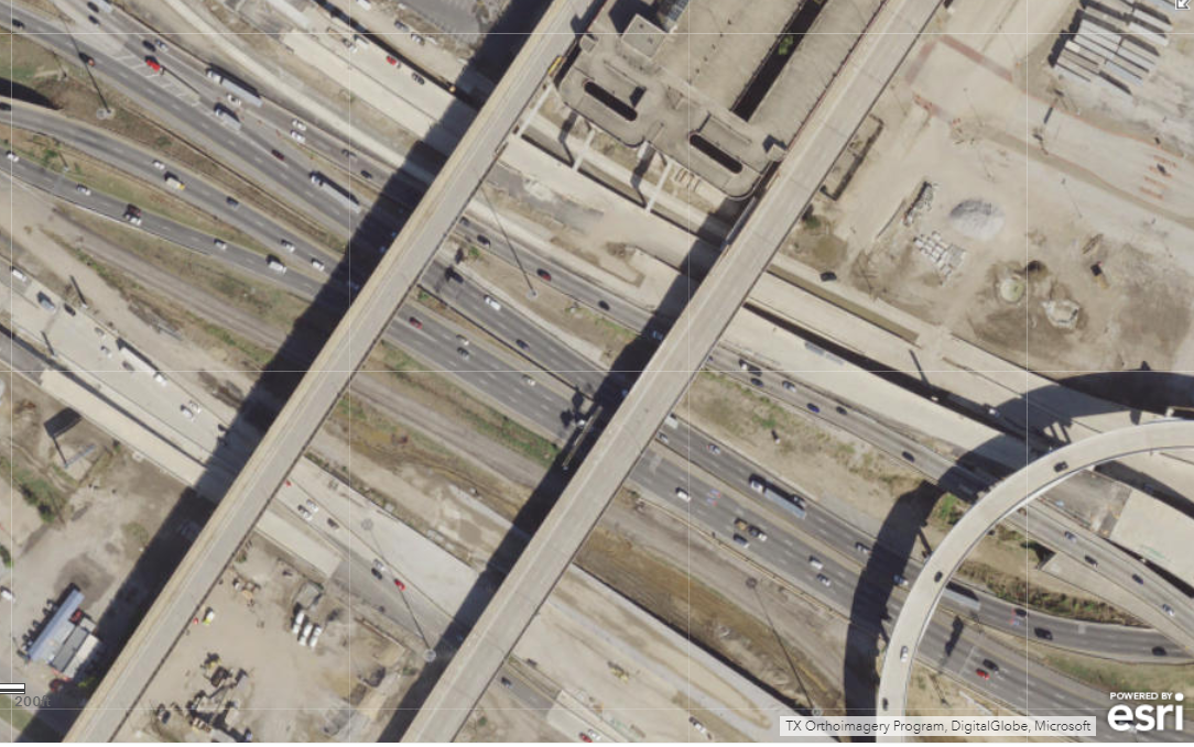

Study area in ArcGIS Online (first image) and Mapquest (second image).
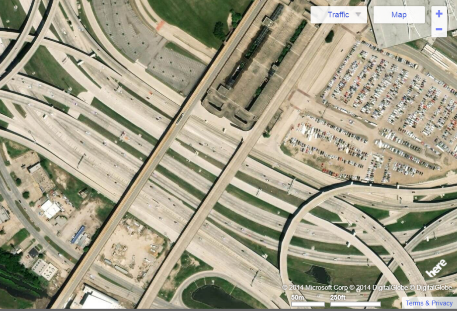
Study area in Yahoo maps (first image) and Bing maps (second image).
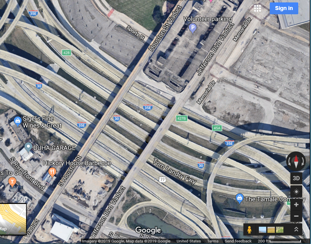
Study area in Google Maps (it appears the same way in Google Earth).
Notice anything missing on the Google Maps image? No traffic. This would be unheard of, day or night, in this busy part of one of the largest cities in the USA. Obviously, a vehicle-removal algorithm has been applied to the image. It is actually quite impressive, because the algorithm seems to only be applied to moving vehicles–cars, buses, trains–and not to stationary vehicles. No doubt it is applied to make the process of viewing and interpreting the now-clearer imagery easier. Interestingly, the moving-vehicle removal seems to only, at the present time, be present in running Google Maps on the web on a tablet or laptop: Running the Google Maps app on a smartphone shows moving vehicles (below).

Study area in Google Maps app on smartphone.
Key takeaway points and teachable moments here include: (1) Images that can be obtained in web mapping services, in geodatabases, and portals should not be considered the same view that would be seen if someone were to be peering over the side of a UAV, airplane, spacecraft, or standing next to a webcam when the image was captured. They can and are manipulated for a variety of purposes. They need to be viewed critically. At the same time, we can marvel and appreciate the many choices we have nowadays in imagery for use in geospatial analysis. (2) The machine learning and artificial intelligence techniques applied to imagery are further evidence for the enterprise nature of geotechnologies: GIS is increasingly connected to mainstream IT trends and innovations.
–Joseph Kerski
Global Land Cover Facility goes offline
The world of geospatial data portals is dynamic; new sites appear and others disappear. Sites are shut down due to the end of a funding period, changes in technologies, or as a result of mission or personnel changes. One of the earliest and most useful sites particularly for remotely sensed imagery recently went off-line–the Global Land Cover Facility from the University of Maryland. Their notice said, “The GLCF has had a very good run since 1997! Originally it was funded under NASA’s Earth Science Information Partnership (under the inspired leadership of Martha Maiden of NASA). Subsequently it was maintained to support our NASA-funded research activities especially those concerned with Landsat data. We feel we have attained what we wanted to accomplish, and now it’s time for us to move on and explorer other ventures. The data and services provided by GLCF are now mostly available via government agencies, especially USGS and NASA.”
To expand on the last note above, what should you, the GIS user who loves imagery, do? For the time being, the GLCF data are still on a no-graphics FTP site, here: ftp://ftp.glcf.umd.edu/. But better yet, we have examined numerous functioning imagery portals on this blog; start here. These include, for example, LandViewer, EOS Data Analytics, NASA AVIRIS, the GeoPortal, Lidar from USGS, DevelopmentSeed, Sentinel-2, and many others.
Thank you, GLCF! You provided a wonderful service, and will be missed.
–Joseph Kerski
Sensing air quality while photographing streets
As described in an article in Business Wire, air quality will be monitored on Google’s Street View vehicles starting with 50 cars in California. Resulting from an agreement between Google and Aclima, carbon dioxide (CO2), carbon monoxide (CO), nitric oxide (NO), nitrogen dioxide (NO2), ozone (O3), and particulate matter (PM2.5) will be sensed initially. “This snapshot data will be aggregated and designated with a representativeness indicator and will be made available as a public dataset on Google BigQuery. The complete dataset will be available upon request to advance air quality science and research.” For a video version of this essay, click here.
Because Google Street View vehicles are already collecting in many countries (though not all, for quite a variety of reasons, as we mention in our book), monitoring air quality seems like an efficient partnership to gather this information. Doing so by vehicle rather than via a standard fixed-position air quality monitoring station adds the benefit of monitoring in many areas, and over many time periods throughout the day in those areas. One possible challenge in assessing the resulting data is that the points will be gathered in different places, with little repeated detection in the same place at the same time. In a very real sense, the Google Street View vehicles become part of the Internet of Things. I wonder if by having the air quality sensors on the vehicles whether Google will be sending the vehicles out more often than their standard street view updates require; i.e. whether the new goals will actually influence the schedule of the data gathering itself. In a very real sense, if that happens, it is another example of the disruptive transformational nature of modern web GIS.
I suspect this is only the beginning. Given increased demand for data at finer and finer scales, it only makes sense for government organizations, private companies, and nonprofit organizations to think about the existing platforms and mechanisms by which data is already collected, and broker relationships to attach their own data gathering to these existing platforms. It is conceivable that the Street View vehicles could be outfitted with additional sensors, and, in a short time from now, the vehicles will be analogous to smartphones: Because smartphones can do so much more than make calls and receive calls, calling has become only a minor part of their functionality. Perhaps in only a year or two, people will have to be reminded that the Street View vehicles can actually take photographs of the neighborhoods they are passing through.
–Joseph Kerski

Imaging Spectrometer data from NASA AVIRIS
The NASA AVIRIS mission has generated imaging spectrometer data for many areas of the USA since the 1990s. The AVIRIS download portal for data from 2006 onward is on a node at NASA, here. The AVIRIS sensor collects data that can be used for characterization of the Earth’s surface and atmosphere from geometrically coherent spectroradiometric measurements. This data can be applied to studies in the fields of oceanography, environmental science, snow hydrology, geology, volcanology, soil and land management, atmospheric and aerosol studies, agriculture, and limnology. Applications under development include the assessment and monitoring of environmental hazards such as toxic waste, oil spills, and land/air/water pollution. With proper calibration and correction for atmospheric effects, the measurements can be converted to ground reflectance data which can then be used for quantitative characterization of surface features. In short, AVIRIS can collect in over 200 bands and therefore it can help analysts work out details such as vegetation health, or even species type, from the data.
The AVIRIS portal, presented in a Google map with popups with download links, as well as the metadata file (in plain text format, available here) both look very dated. But this is a case where we encourage the user to give it a try–the portal may not look modern, but the data behind the portal is incredibly useful. One can toggle data layers in the right hand corner of map to show All AVIRIS data or the Attrib. Filtered data (data that meets the attribute criteria but ignores the spatial filter). One can also bound a box on the map, which has long been a favorite feature of mine on data portals, using the red rectangle to activate. To update the spatial filter, click the “Update Map” button below the map. The files are not streamed, but must be downloaded; perhaps because of their large size (typically over 1 GB). Again, think “old school” formats – zip files and TAR files, but again, the data are plentiful and useful. A set of previews are available, for example, here, and shown below. For more information about AVIRIS data, see this link and this link.
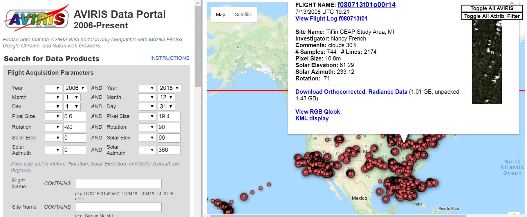
The AVIRIS data portal.
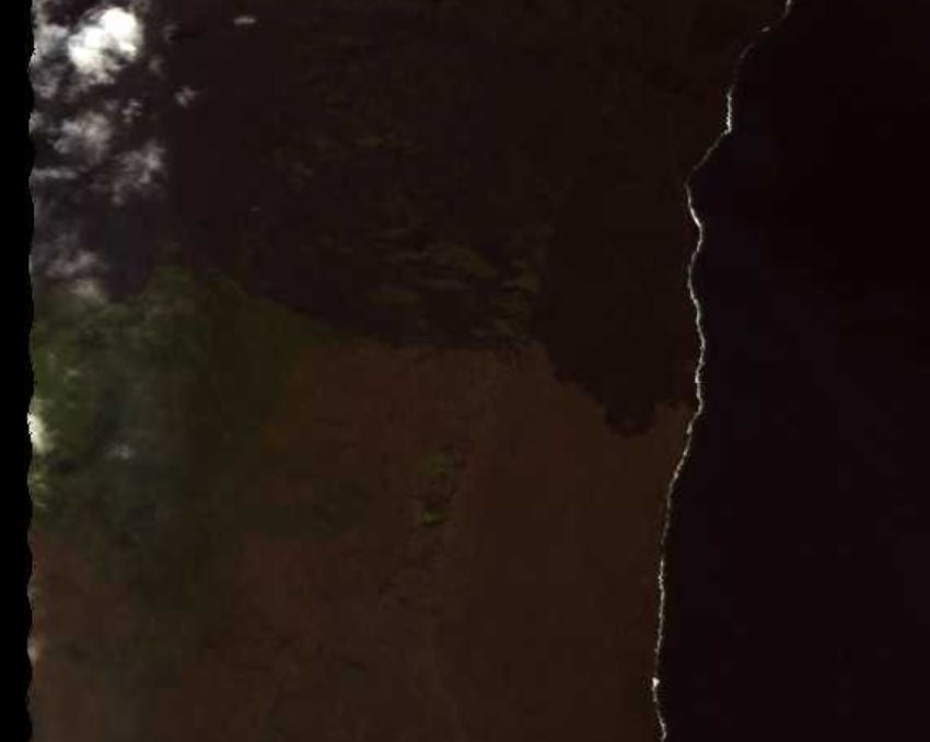
A sample AVIRIS image.
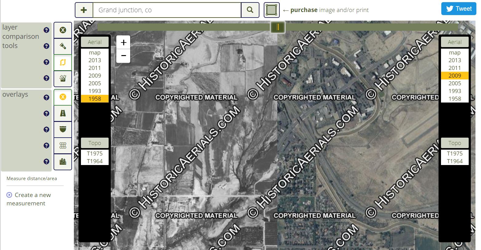
Need access to thousands of historical aerials and topographic maps at your fingertips? Try www.historicaerials.com
Imagine having instant access to thousands upon thousands of historic aerial photographs and topographic maps to be able to examine change over time. Thanks to a resource called Historic Aerials, you do have this wealth of information at your fingertips. These aerials and maps, which go back 50, 60, and even 70 years or more, can be used for research, for instruction, for planning, and for other purposes. Being in the field of geography and GIS education, I can think of many disciplines in which this can be used — urban and rural geography most certainly, but also biology, environmental science, city planning, history, agriculture, and also in GIS courses. These resources foster spatial thinking about changes in time and space, from natural causes, such as volcanic eruptions or changes in river meanders, or from human causes, such as urbanization or the construction of reservoirs. And given the connection that often exists between human and natural changes, sometimes these causes are intertwined–the construction of jetties along barrier islands often influences the naturally occurring longshore sediment transport and the migration of the islands themselves, as can be seen by comparing the historic to modern aerials of Ocean City, Maryland, for example.
The interface for the Historic Aerials is intuitive and provides tools that allow the user to compare USGS topographic maps of various years as well as the aerials themselves. In the example below, I compare a 1958 with a 2009 aerial of a section of Grand Junction Colorado, before and after Interstate 70 and some surrounding housing was constructed. You can also use the spotlight tool to “see back in time” for wherever you pan your cursor, and you can turn on the streets to see where streets would one day be constructed on top of historical imagery.
The site comes from the Nationwide Environmental Title Research group, which has spent over 20 years collecting the worlds largest database of historical aerial images and topographical maps of the USA. Their sources include USGS and USDA imagery, several private collections, and they are continually acquiring more. All the imagery they collect is orthorectified to provide the data in a searchable and precise geo-locatable format. A print or digital image (for GIS users, GeoTIFF will be especially useful, delivered in lat-long coordinates, but JPG and PNG are also offered) of any of the maps or aerials is available. In addition, a subscription service allows anyone to access the site with the following advantages: Full screen viewer, no advertising, PDF builder, quick JPEG downloads, and multiple user accounts. I had a pleasant chat with the good people behind the site and found that their prices are quite reasonable. Their FAQ, forum, and tutorials make it clear that they are committed to user success with these resources, and there are human beings behind this site to help as well.
Quite frankly, during my years working at the USGS, I always dreamed that my agency would create something like this. Kudos to the HistoricAerials staff for making this a reality!
The interface for HistoricAerials.com is quite intuitive and allows for fascinating investigations back in time for lands across the USA.
Planet’s Imagery Now Viewable by the Public
Back in 2014, we wrote about inexpensive and the miniaturization of remote sensing, as exemplified in Planet Labs then-new small satellites. A year later, we wrote about the company’s (now called “Planet”) Open Region initiative with the United Nation to share imagery under a Creative Commons license. As described in this National Geographic post, Planet has now created a web mapping tool that allows users to examine two million images, updated monthly. The tool, called Planet Explorer Beta, contains images dating back to 2016, at anywhere from 3 to 40 meters. My favorite feature so far on the Explorer Beta is the ability to drag-and-drop two images to create a swipe map, to compare changes over time for any given area. If you create an account and log in, you can explore daily, rather than just monthly, imagery. Whether logged in or not, the tool is an excellent and amazing resource for teaching and research. It could also serve as a great way to introduce students and faculty to imagery and encourage them to go further and deeper with remote sensing.
As most of the readers of this blog are work in the field of GIS, they will want to know how to use this imagery in a GIS. The viewer described above is just that–a viewer. You can only view the images online. To actually access the data for use in your GIS or remote sensing work, begin with Planet’s Documentation. As Planet is a professional satellite image company, it comes as no surprise that users have a multitude of options from which to choose–bands, date and time, cloud cover, sun elevation and azimuth, rectification, data format, and much more. The imagery is available via a Planet Explorer interface and a Data API, which requires installing a Python client.
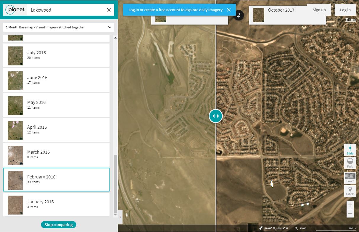
Comparing imagery from two time periods in Colorado, USA, using Planet’s Planet Explorer Beta.
Accessing Landsat 8 Data through DevelopmentSeed’s Libra Portal
Libra is a very useful browser for open Landsat 8 satellite imagery. You can use it to browse, filter, sort, and download imagery for the entire planet. Libra was developed by DevelopmentSeed, an engineering team solving complex problems with open software and open data, and AstroDigital, a company focused on providing imagery analyzed in real time and streamed to applications via their API.
Libra’s map interface is one of the most straightforward and useful that I’ve ever seen for imagery as evidenced in the screenshot below. On the interface, each circle on the map represents the number of available images at that location. Filters at the top of the map can be used to select a date range, cloud cover percentage, and sun azimuth angle. Bundled downloads are available within one week of the image being taken. Individual bands are available for all 2015 scenes.
Once your download is complete, the site organizers recommend Landsat-util for processing the raw image and getting it ready for publication and analysis. Search results are powered by Landsat 8 Metadata API and images from USGS Earth Explorer. Downloads are provided via Google Earth Engine and Amazon Web Services.
More information and the official announcement about this resource can be found here. Give it a try and let us know what you think.

Interface for the Libra Development Seed Landsat Site.
New LandViewer Tool for Quickly Finding and Analyzing Satellite Imagery
The LandViewer tool and data portal quickly and painlessly allows you to browse and access satellite imagery for the planet. The tool, developed by the Earth Observing System Inc.’s Max Polyakov, currently features Landsat 8 and Sentinel 2 imagery with more image sets soon to arrive. Landsat 8 carries two instruments: The Operational Land Imager (OLI) sensor includes refined heritage bands, along with three new bands: a deep blue band for coastal/aerosol studies, a shortwave infrared band for cirrus detection, and a Quality Assessment band. The Thermal Infrared Sensor (TIRS) provides two thermal bands. Sentinel 2 is an Earth observation mission developed by the ESA as part of the Copernicus Programme to perform terrestrial observations in support of services such as forest monitoring, land cover changes detection, and natural disaster management.
Using the LandViewer tool, you can quickly zoom on an interactive web map to your area of interest. You can filter on geography and time, including cloudiness, sun angle, and other parameters. At the time of this writing, 18 filters such as Atmospheric Removal, Panchromatic, NDVI, Thermal Infrared, False Color, and more, are available so that you can obtain the band combinations most suitable to your analysis in the areas of agriculture, geology, or other applications. A very helpful image interpretation screen is available to help you choose the combination that are best for your analysis goals. You can do some contrast stretching in the web tool itself. Then after signing in to the site, you can download the images in GeoTIF for further analysis using your favorite GIS tools.
The tool was also reviewed on the Geoawesomeness web site, and I wholeheartedly agree with their sentiments expressed–this is one of the most useful and fastest satellite image portals I have used. It is useful for research but also, given its ease of use, can even be used effectively to teach concepts of remote sensing. Give it a try and let us know in the comments section what you think.
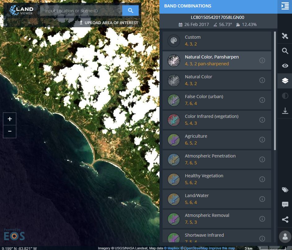
Landsat scenes with band combinations possible for an area on the southwest side of Costa Rica.
Contributors
Gallery


Recent Comments