Archive
Creating fake data on web mapping services
Aligned with our theme of this blog of “be critical of the data,” consider the following recent fascinating story: An artist wheeled 99 smartphones around in a wagon to create fake traffic jams on Google Maps. An artist pulled 99 smartphones around Berlin in a little red wagon, in order to track how the phones affected Google Maps’ traffic interface. On each phone, he called up the Google Map interface. As we discuss in our book, traffic and other real-time layers depend in large part on data contributed to by the citizen science network; ordinary people who are contributing data to the cloud, and in this and other cases, not intentionally. Wherever the phones traveled, Google Maps for a while showed a traffic jam, displaying a red line and routing users around the area.
It wasn’t difficult to do, and it shows several things; (1) that the Google Maps traffic layer (in this case) was doing what it was supposed to do, reflecting what it perceived as true local conditions; (2) that it may be sometimes easy to create fake data using web mapping tools; hence, be critical of data, including maps, as we have been stating on this blog for 8 years; (3) the IoT includes people, and at 7.5 billion strong, people have a great influence over the sensor network and the Internet of Things.
The URL of his amusing video showing him toting the red wagon around is here, and the full URL of the story is below:
https://www.businessinsider.com/google-maps-traffic-jam-99-smartphones-wagon-2020-2
I just wonder how he was able to obtain permission from 99 people to use their smartphones. Or did he buy 99 photos on sale somewhere?
–Joseph Kerski
Using Kaggle big data in a GIS
Kaggle is a platform for predictive modelling and analytics competitions in which statisticians and data miners compete to produce the best models for predicting and describing the datasets uploaded by companies and users. This crowdsourcing approach relies on the fact that there are countless strategies that can be applied to any predictive modelling task and it is impossible to know beforehand which technique or analyst will be most effective. [Wikipedia]. Over a half million people are in the Kaggle community, from nearly every country in the world. Kaggle was acquired by Google a few years ago. You can also learn about R, SQL, machine learning, and other topics on the site. Why mention Kaggle in our geospatial data blog? Kaggle hosts data sets on their site, some of which are spatial in nature, and some of which are truly “big data” (such as 9 million open images URLs), and as such, it represents a source of information for the GIS analyst, researcher, and instructor.
Because the data posted to Kaggle comes from a global community with diverse interests, expect an unusual array of data sets, from chest x-rays, superheroes, air quality, to birdsongs. Some data are from surveys. Many intriguing gems exist; for example, one of the data sets of interest to me as a geographer on the Kaggle site is the world happiness data . It is available as a CSV for three different years. The only unfortunate aspect of these tables is the lack of a country code; and relying only on name of country could present problems in joining the data to a map.
One can also learn about data sources by spending time on the Kaggle site. For example, I learned about Uber Movement that contains data from selected cities and points of departure, Sports Reference that someone used to scrape 120 years of Olympic history data from, and a cancer imaging archive that someone used to obtain disease type and location. Given the nature of the site, expect all sorts of oddities: My search on mountains of the world resulted in lots of “404 Not Found” errors; some data is documented and others not so much; and obtaining some of the data requires the user to be a programmer. Still, Kaggle is a useful and unusual source worthy of attention, and given the rapid evolution in big data and crowdsourcing, as we frequently write about on this blog, I expect that we will be seeing many more sites like this in the future.
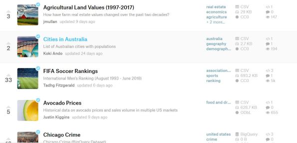
A section of the Kaggle listing of data sets, showing the diversity of themes, scales, and sizes.
Crowdsourcing Story Maps and Privacy
As we have pointed out in this blog, we have had the capability to create story maps (multimedia-rich, live web maps) for a few years now, and we have also had the capability to collect data via crowdsourcing and citizen science methods using a variety of methods. But now the capability exists for both to be used at the same time–one way is with the new crowdsourcing story map app from Esri.
The crowdsource story map app joins the other story map apps that are listed here. To get familiar with this new app, read this explanation. Also, you might explore a new crowdsourced story map that, after selecting “+ Participate”, prompts you for your location, photograph, and a sentence or two about attending, in this case, the Esri User Conference. If you did not attend, examining the application will give you a good sense for what this new app can do.
It’s not just this story map that has me interested. It is that this long-awaited capability is now at our fingertips, where you can, with this same app, create crowdsourced story maps for gathering data on such things as tree cover, historic buildings, noisy places, litter, weird architecture, or something else, on your campus or in your community. It is in beta, but feel free to give this crowdsourcing story map app a try.
We have also discussed location privacy concerns both here and in our book. The story Map Crowdsource app is different from the other Story Maps apps in that it enables people to post pictures and information onto your map without logging in to your ArcGIS Online organization. Thus, the author does not have complete control over what content appears in a Crowdsource story. Furthermore, the contributor’s current location, such as their current street address or locations they have visited, can be exposed in a Crowdsource app and appear with their post in these maps as a point location and as text. This may be fine if your map is collecting contributions about water quality, invasive plant species, or interesting places to visit in a city, where these location are public places. But it may not be desirable for other subject matter or scenarios, especially if people may be posting from their own residence.
Thus, it is up to you as the author of a Story Map Crowdsource app to ensure that your application complies with the privacy and data collection policies and standards of your organization, your community, and your intended audience. You might wish to set up a limited pilot or internal test of any Story Map Crowdsource project before deploying and promoting it publicly in order to review if it meets those requirements. And for you as a user of these maps, make sure that you are aware that you are potentially exposing the location of your residence or workplace, and make adjustments accordingly (generalizing your location to somewhere else in your city, for example) if exposing these locations are of concern to you).
Thus, the new crowdsource story map app is an excellent example of both citizen science and location privacy.
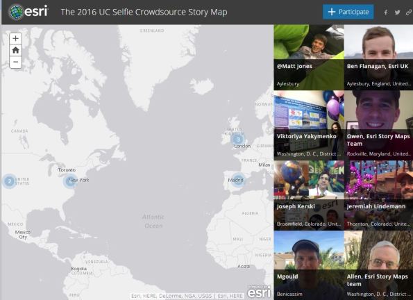
Example of the new crowdsourcing story map app.
Crowdsourced Street Views with Mapillary
In our book and in this blog, we often focus on crowdsourcing, citizen science, and the Internet of Things. Mapillary, a tool that allows anyone to create their own street level photographs, map them, and share them via web GIS technology, fits under all three of these themes. The idea behind Mapillary is a simple but powerful one: Take photos of a place of interest as you walk, bicycle, or drive using the Mapillary mobile app. Next, upload the photos to Mapillary again using the app. Your photos will be mapped and connected with other Mapillary photos, and combined into street level photo views. Then you can explore your places and those from thousands of other users around the world.
Mapillary is part of the rapidly growing crowdsourcing movement, also known as citizen science, which seeks to generate “volunteered geographic information” content from ordinary citizens. Mapillary forms part of the Internet of Things (IoT) because people are acting as sensors across the global landscape using this technology. Mapillary is more than a set of tools–it is a community, with its own MeetUps and ambassadors. Mapillary is also a new Esri partner, and through an ArcGIS integration, local governments and other organizations can understand their communities in real-time, and “the projects they’re working on that either require a quick turnaround or frequent updates, can be more streamlined.” These include managing inventory and city assets, monitoring repairs, inspecting pavement or sign quality, and assessing sites for new train tracks. One of Mapillary’s goals was to provide street views in places where no Google Street Views exist.
Many organizations are using Mapillary: For example, the Missing Maps Project is a collaboration between the American Red Cross, British Red Cross, Médecins Sans Frontières-UK (MSF-UK, or Doctors Without Borders-UK), and the Humanitarian OpenStreetMap Team. The project aims to map the most vulnerable places in the developing world so that NGOs and individuals can use the maps and data to better respond to crises affecting these areas.
Using the discovery section on Mapillary, take a tour through the ancient city Teotihuacán in Mexico, Astypalaia, one of the Dodecanese Islands in Greece, Pompeii, or Antarctica. After you create an account and join the Mapillary community, you can access the live web map and click on any of the mapped tracks.
Mapillary can serve as an excellent way to help your students, clients, customers, or colleagues get outside, think spatially, use mobile apps, and use geotechnologies. Why stop at streets? You could map trails, as I have done while hiking or biking, or map rivers and lakes from a kayak or canoe. There is much to be mapped, explored, studied, and enjoyed. If you’d like extra help in mapping your campus, town, or field trip with Mapillary, send an email to Mapillary and let the team know what you have in mind. They can help you get started with ideas and tips (and bike mounts, if you need them).
For about two years, I have been using Mapillary to map trails and streets. I used the Mapillary app on my smartphone, generating photographs and locations as I hiked along. One of the trails that I mapped is shown below and also on the global map that everyone in the Mapillary community can access. I have spoken often with the Mapillary staff and salute their efforts.
We look forward to hearing your reactions and how you use this tool.
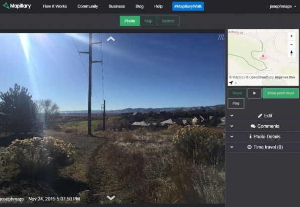
Mapillary view of a trail in Colorado USA that I created.
The National Geodetic Survey Data Explorer and Citizen Science
The National Geodetic Survey (NGS) Data Explorer is a web mapping application, launched by the Survey in 2012, allowing users to view geodetic control data across the USA and its territories. To use, zoom in on the map on a location of interest, and select “plot marks”. You will see all of the control marks in that vicinity, including CORS, GPS sites, horizonal control markers, and vertical control markers. Furthermore, the NGS datasheet documentation for each control mark is accessible from the same mapping interface, including the latitude, longitude, elevation, position source, complete description of the physical marker, the history of the marker, the condition of the marker, and other information.
The mapping site was launched in 2012 and has seen improvements since then. I found it easy to use, and very useful. The only thing I could not find that would be extremely helpful is the ability to export from the map and data set to a variety of formats–a geodatabase would be nice, or at the very least, a spreadsheet. I also could not find how I could “select” points that I was interested in, aside from clicking on each one on the map.
Our book discusses the impact of citizen science efforts on geospatial data. On this note, the NGS also runs a “GPS on Bench Marks” effort, a citizen science program for finding and reporting on the conditions of NGS benchmarks. By providing GPS on bench marks today, people can help NGS improve the next hybrid geoid model, increasing access to the North American Vertical Datum of 1988, and enabling conversions to the new vertical datum in 2022. Participating could also help the local surveying community know about nearby marks by improving scaled horizontal positions and updating the mark condition or description by submitting a mark recovery. A web map in ArcGIS Online is here.
If you are interested in other activities and services from the National Geodetic Survey, see the recent excellent summary in The American Surveyor. This includes guidelines for using post-processing GPS technology to establish accurate ellipsoid heights and orthometric heights, the new North American Vertical Datum that will be released in 2022, and updates on the GEOCON datum transformation tools.

National Geodetic Survey Data Explorer.
Truth in maps
There’s a saying that goes something along the lines of …’Whoever wins the war gets to write the history’. Perhaps a similar saying could be applied to map making … ‘Whoever makes the map gets to interpret the location‘.
A map, paper or digital, is a representation of the Earth’s surface. That representation is an interpretation of the location, based on a particular perspective. Although a great deal of modern map making is automated, a certain amount of cartographic interpretation is still involved. Recent years have also seen a huge increase in the volume of citizen-generated mapping, freely available to anyone with an internet connection. Different mapping algorithms, cartographers, or citizen map makers may choose to emphasise certain features at the expense of others, introducing a degree of bias in the final product.
In a recent article for the BBC, Why modern maps put everyone at the centre of the world, Simon Garfield observes that “… new maps are gridded by technicians and pixel masters, who may be more concerned with screen-loading speeds than the absence on a map of certain parts of, say, Manchester or Chicago.”
A map is a version of a location and like versions of history, some are more reliable than others. As end users, few of us can go check for ourselves, so we have to rely on the map producers to not only minimize the bias, but also document the manner in which the data was collected so we can decide for ourselves which version suits our requirements best.
BioBlitz and Citizen Science: Implications for Data Users
During the past few days, I had the opportunity to participate in BioBlitz 2012 at Rocky Mountain National Park, Colorado, USA. BioBlitz (http://www.nationalgeographic.com/explorers/projects/bioblitz/bioblitz-co-2012/) is a 10-year partnership between the US National Park Service and National Geographic with 3 goals: Highlight the diversity of national parks by conducting a taxonomic inventory, public outreach, and to inspire young people to pursue careers in science and geography. The citizen science focus to the event reinforced the concepts that Jill Clark and I wrote about in the book The GIS Guide to Public Domain Data. Nowhere was this clearer than when I went into the field to collect and categorize macroinvertebrates in a montane stream in the shadow of Longs Peak with 40 students aged 11 to 13.

Collecting macroinvertebrates in stream, Rocky Mountain National Park.
After collecting the data over a period of five hours, the macroinvertebrate data was then identified by the students according to a detailed classification chart. I was very impressed by the students’ diligence and teamwork. The data was then input into a web-GIS called FieldScope, created by National Geographic and based in part on Esri technology, and viewable that evening online by anyone on the web.

Citizen science data being input into FieldScope.
All told, hundreds of students, over 100 scientists, and thousands of the general public collected data for two days, resulting in over 400 bird, fungi, macroinvertebrate, animal, and vascular plant species that had never been documented in this particular national park before.
As citizen science projects gain in popularity, enabled by powerful yet easy-to-use web-GIS and field collection instruments, the challenge becomes: How can data collected by a wide variety of people with a wide variety of backgrounds be managed and cataloged in such a way that is not only useful, but also, through metadata, allows people to understand who collected it, and how it was collected, categorized, and input into the GIS?
Contributors
Gallery


Recent Comments