Archive
Top 7 Satellite Imagery Sources
My colleagues at EOS.com recently wrote a summary of what they consider to be the top 7 satellite imagery sources: https://eos.com/blog/7-top-free-satellite-imagery-sources-in-2019/.
These include sources that we have reviewed on this Spatial Reserves blog, here: https://spatialreserves.wordpress.com/2019/02/18/the-top-10-most-useful-geospatial-data-portals-revisited/ as well as the top Landsat sites that we reviewed, here: https://spatialreserves.wordpress.com/2019/08/04/the-top-10-landsat-image-sites/, but it also includes a few we have not reviewed, such as EOS’ own Landviewer.
It is good to see reviewed collections such as these that have an aim to make life a bit easier for us as data consumers and analysts.
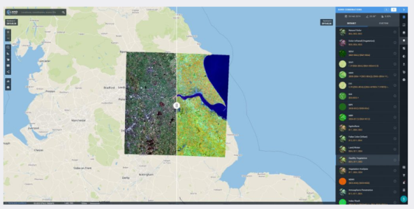
Landviewer data portal, from EOS.
–Joseph Kerski
The Top 12 Most Useful Landsat Image Sites
Recently, I wrote an essay about the sites that are, in my judgment, the top 10 in terms of containing useful geospatial data. Now, I would like to describe what I consider to be the top sites for Landsat satellite imagery in terms of content and ease of use. Let’s limit it to the Top 12. Why might such a list be helpful? First, there is no “one single site” to obtain Landsat data, and second, the sites are in continual flux, with some such as the Global Land Cover Facility disappearing and some having recently been created. As with any consideration of data portals, make sure you have done a careful assessment of your data needs–band combinations, resolutions, formats, streamed services vs. downloaded files, dates, how many files you need, and so on, to guide you before you start searching.
(1) The DevelopmentSeed’s Libra Portal. I recently used this resource to include in the update (to ArcGIS Pro) for the Brazil land use change lesson that we host on the Spatial Reserves set of 10 hands-on exercises. We wrote about the Libra portal here, and it remains in my judgment a no-nonsense resource that is easy to use with a wealth of options and data.
(2) The EOS Data Analytics Landviewer, as we described here, is very useful and user friendly. The EOS staff also wrote this helpful review of imagery sites. Like the DevelopmentSeed portal, I find its user interface to be very straightforward. The Landviewer includes Sentinel-2 and other imagery, as well.
(3) Esri’s ArcGIS Living Atlas of the World has made amazing strides in content and usability since we first wrote about it here. Most of Esri’s ArcGIS Living Atlas data is provided as streaming services instead of download, but for an increasing number of workflows, this is actually perfect. The Living Atlas has in a few short years become probably the largest collection of spatial data on the planet, and so I recommend keeping it in mind not just for satellite imagery, but vector data as well, some of which can be downloaded, and all of it can be streamed. Plus, you can contribute your organization’s data to the Living Atlas. On a related note, be sure to check ArcGIS Online for imagery as well, the web GIS platform that Esri’s ArcGIS Living Atlas is based on.
(4) The Esri Landsat Thematic Bands Web Mapping Application. As we described in this post, through this application, you can access a variety of up-to-date and historical images in various band combinations, and save specific configurations and locations to share with others.
(5) The USGS Earth Explorer. While the Earth Explorer is in my view in need of improvement from the user’s perspective, it is functional and does contain a wealth of data, and sometimes is the best source for specific image sets.
(6) The USGS Landsat Look Viewer. I prefer the Landsat Look viewer’s interface over the Earth Explorer, as I described here.
(7) The USGS GloVIS viewer. I also prefer this interface over Earth Explorer. GloVIS dates back to 2001 and was redesigned in 2017.
(8) Landsat 8 archive on Amazon AWS. As we described here, this has emerged as an amazing archive of data. The user, as one might expect, is faced with a list of files rather than a fancy User Interface, but sometimes accessing specific files is exactly what one needs.
(9) Landsat archive in Google Cloud. Like the AWS experience, the UI is spartan but its data sets are vast, which is what one would expect from Google.
(10) The FAO GeoNetwork. This site focuses on vector data sets, but its raster holdings include many useful Landsat mosaics for specific geographic areas such as countries.
(11) Remote Pixel. This is incredibly easy to use and blazing fast to zoom, pan, and query, and largely the work of a single individual. It is my hope that if its developer does not maintain it in the future, that someone else will, because it is so marvelous. Fortunately, the developer shows others how to host something like this themselves.
(12) The Copernicus Open Data Access Hub, as its name implies, focuses on Sentinel data, but if you are interested in Landsat imagery, you probably are interested in other imagery as well.
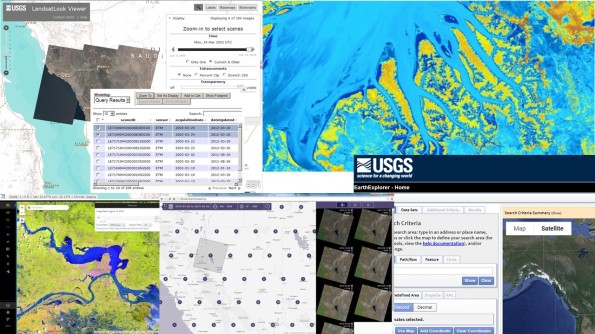 A few of the image portals described in this article. We look forward to your feedback!
–Joseph Kerski
Imagery: It is what it is: Well, not always.
Being critical of all data, including geospatial data, is a chief theme of this blog and our book: Use it wisely. Know where it came from. Know what has been done to it. Imagery has always been an important component of geospatial data, and today, it takes many forms, ranging from images taken on the ground with a phone or camera to those taken by webcams, UAVs, aircraft, satellites, and more. Doesn’t this imagery “tell it like it is” and is it therefore exempt from us casting a critical eye on it? I contend that no, images must be viewed critically so that you can determine if they are fit for your use in whatever project you are working on. For more, read below and see my video here.
As one example in a larger story, consider the example of the removal of individuals from 20th Century photographs in the USSR. But lest we think such image doctoring was a thing of the past, there are dozens of articles that arise in current web searches highlighting modern day image manipulation, from fashion magazines to science journals, some inadvertent, some on purpose, some for purposes to benefit society and some unfortunately to mislead. In the geospatial world, consider the image offsets on Google Maps in China that we wrote about not long ago.
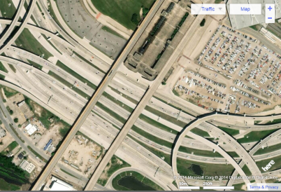
Let’s discuss another aspect of image manipulation. Consider the satellite images below. They cover many different dates and are derived from many different sources. But pay attention to what’s on–or off-the highways in the images. These images all cover the same location—Interstate 30 – 35E interchange on the southwest side of downtown Dallas Texas USA, known locally as the Mixmaster. Constructed between 1958 and 1962, you can spot, in some images, recent much-needed improvements due to the substantial increase in traffic volume in the past 60 years.
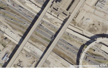
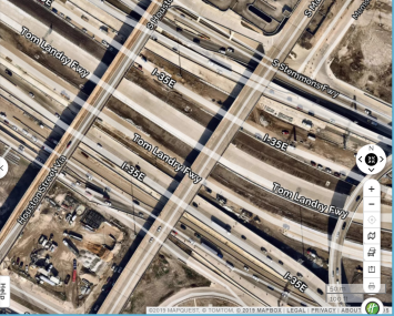
Study area in ArcGIS Online (first image) and Mapquest (second image).
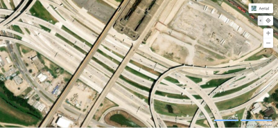
Study area in Yahoo maps (first image) and Bing maps (second image).
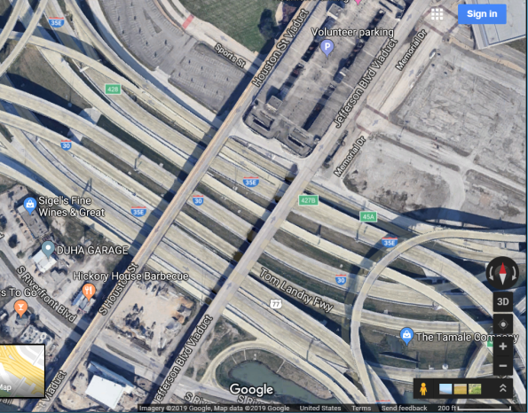
Study area in Google Maps (it appears the same way in Google Earth).
Notice anything missing on the Google Maps image? No traffic. This would be unheard of, day or night, in this busy part of one of the largest cities in the USA. Obviously, a vehicle-removal algorithm has been applied to the image. It is actually quite impressive, because the algorithm seems to only be applied to moving vehicles–cars, buses, trains–and not to stationary vehicles. No doubt it is applied to make the process of viewing and interpreting the now-clearer imagery easier. Interestingly, the moving-vehicle removal seems to only, at the present time, be present in running Google Maps on the web on a tablet or laptop: Running the Google Maps app on a smartphone shows moving vehicles (below).

Study area in Google Maps app on smartphone.
Key takeaway points and teachable moments here include: (1) Images that can be obtained in web mapping services, in geodatabases, and portals should not be considered the same view that would be seen if someone were to be peering over the side of a UAV, airplane, spacecraft, or standing next to a webcam when the image was captured. They can and are manipulated for a variety of purposes. They need to be viewed critically. At the same time, we can marvel and appreciate the many choices we have nowadays in imagery for use in geospatial analysis. (2) The machine learning and artificial intelligence techniques applied to imagery are further evidence for the enterprise nature of geotechnologies: GIS is increasingly connected to mainstream IT trends and innovations.
–Joseph Kerski
Daily Satellite Imagery for Planet Earth
In this blog, we have written about the revolution occurring in the remote sensing world, centered on inexpensive and crowdsourced remote sensing. As described in this TED talk from Planet Labs’ Will Marshall, Planet Labs has launched small satellites of the dimensions 10 x 10 x 30 cm, weighing 4 kg, which can take images at 10 times higher resolution than conventional large satellites. Early in 2014, the International Space Station launched 28 of these small satellites. They plan to launch more than 100 that will image the Earth from a single orbital plane as the planet rotates beneath it. Will refers to this system as a “line scanner for the planet.”
While our book and this blog discuss geotechnologies from a technical point of view, we also highlight the societal implications of these innovations. Planet Labs’ work fits in well with these themes, because they are not only technically innovative, but their goal is to democratize remote sensing data. They are asking: “If you had access to imagery for the whole planet on a daily basis, what would you do with it?” Every point on the planet will be imaged every day with their platform.
And while the partnerships and avenues of dissemination data are still being worked out, this and similar efforts in the remote sensing world will surely impact data availability, crowdsourcing, copyright, privacy, decision-making, and other topics important to science, education, and society, in the months and years ahead.

Planet Labs: Imagery and its democratization.
Track on Track: Reflections on GPS Accuracy on a Running Track
Recently, while at the Applied Geography Conference in Atlanta, I decided to test the spatial accuracy of my smartphone’s GPS in a challenging environment–a rooftop running track. Although located on a roof, the track was surrounded by buildings far taller, and in downtown Atlanta, a location with many other buildings impeding signals from GPS, wi-fi hotspots, and cell phone towers. A further challenge to the GPS positional accuracy was that each lap on the track was only 0.10 miles (0.16 km), and therefore, I would not travel very far across the Earth’s surface.
After an hour of walking, and collecting the track on my smartphone with a fitness app (Runkeeper), I uploaded my track as a GPX file and created a web map of it in ArcGIS Online. As I expected, the track’s position was compromised by the tall buildings–I only had a view of about half the sky during my time on the roof. As you can measure for yourself on the map linked above, the track lines formed a band about 15 meters wide, but interestingly, were more spatially precise along the eastern side of the track, where the signal was better, as you can see in my video that I recorded at the same time.
Also, as I have encountered numerous times in the past, a line about 100 meters long stretches to the north. Rest assured that I did not leap off the building, but rather, the first point that the GPS app laid down as I opened the doors to walk outside was about a block away. Then, as I remained outside, the points became more accurate. When you collect data, the more time you spend on the point you are collecting, typically the more accurate that point is spatially.

Track on Track: Reflections of GPS Accuracy on a Running Track.
Another interesting aspect of this study is that if the basemap is changed to satellite imagery, it appears that the track overlaps the tall building to the west. Try it, using the map link above. However, a closer investigation reveals that this is a result of the orthocorrection that was performed on the imagery; the buildings do not appear from “straight overhead”, but rather, they “fall away” to the east. Turn this into another teachable moment: Images, like maps, are not perfect, but they are very useful. We can learn to manage error and imperfection through critical thinking and through the use of geotechnologies. This is a central topic of our book and of this blog.
To dig deeper into issues of GPS track accuracy, see my related post on errors and teachable moments in collecting data, and on comparing the accuracy of GPS receivers and smartphones and mapping field collected data in ArcGIS Online here and here.
Despite these challenges, overall, I was quite pleased with my track’s spatial accuracy, even more so considering that I had the phone in my pocket most of the time I was walking.
UAVs Prohibited in National Parks in the USA
As we state in our book, The GIS Guide to Public Domain Data, oftentimes, technological advancement and adoption proceeds at a faster pace than regulations accompanying it. A perfect example is what is probably the hottest technology in remote sensing right now, and that is UAVs, or Unmanned Aerial Vehicles. The Internet is becoming rapidly filled with stories and videos of footage from UAVs deployed by aerial survey companies, but even more commonly, operated by the general public. For example, this storymap contains footage of UAV imagery flown over a rocket launch, a cruise ship, and more.
While I as a geographer are fascinated by these images and videos, I am at the same time sensitive to the myriad of privacy and safety issues raised by the operation of UAVs. We are beginning to see laws passed to regulate the operation of UAVs on certain lands, such as the recent policy directive against flying these in national parks in the USA.
Jonathan Jarvis, director of the National Park Service, said that “We embrace many activities in national parks because they enhance visitor experiences with the iconic natural, historic and cultural landscapes in our care. However, we have serious concerns about the negative impact that flying unmanned aircraft is having in parks, so we are prohibiting their use until we can determine the most appropriate policy that will protect park resources and provide all visitors with a rich experience.” Some parks had already initiated bans after noise and nuisance complaints from park visitors, an incident in which park wildlife were harassed, and park visitor safety concerns. For example, earlier this year, visitors at Grand Canyon National Park gathered for a quiet sunset were interrupted by a loud unmanned aircraft flying back and forth and eventually crashing in the canyon. Volunteers at Zion National Park witnessed an unmanned aircraft disturb a herd of bighorn sheep, reportedly separating adults from young animals.
The policy memorandum directs park superintendents to take a number of steps to exclude unmanned aircraft from national parks. The steps include drafting a written justification for the action, ensuring compliance with applicable laws, and providing public notice of the action. The memorandum does not affect the primary jurisdiction of the Federal Aviation Administration over the National Airspace System.
The policy memorandum is a temporary measure, and it seems like a wise move. Jarvis said the next step will be to propose a Servicewide regulation regarding unmanned aircraft. That process can take considerable time, depending on the complexity of the rule, and includes public notice of the proposed regulation and opportunity for public comment. The National Park Service may use unmanned aircraft for administrative purposes such as search and rescue, fire operations and scientific study. These uses must also be approved by the associate director for Visitor and Resource Protection.
Near the Esri office in Colorado a month ago, I witnessed my first UAV flight where I did not know who was operating the vehicle. I’m sure we will look back in years to come and realize that we in 2014 were at the dawn of a technology that will no doubt transform GIS and our everyday lives. I anticipate sensors soon capable of capturing imagery in a wide variety of wavelengths, as well as atmospheric and other types of sensors that will further hasten the era of big data. I am hopeful that we will chart a prudent course through the advent of UAVs, taking advantage of the innumerable benefits that UAVs can offer the GIS industry and also society as a whole.
Global Forest Watch initiative
The World Resources Institute (WRI) has recently announced the launch of Global Forest Watch (GFW), a dynamic forest monitoring system that provides aims to provide ‘timely and reliable’ information about the state of the world’s forests. Using a combination of satellite imagery, open access data and crowd sourced information, GFW builds on earlier projects such as the Forest Frontiers Initiative and the Forest Atlases, one of the case studies we discussed in The GIS Guide to Public Domain Data, which promoted the sustainable management of forest resources.
One of the big issues for monitoring forest reserves has been, given the often inaccessible locations, by the time harmful and illegal logging was reported it was invariably too late to stop the deforestation. GFW aims to provide near real-time information on forest clearing activities so local authorities, governments, global business and the general public have access to the latest, and hopefully most accurate, status of forest reserves. The listed data sources include:
- Forest change ( many derived from MODIS data)
- Forest cover
- Conservation
- Forest Use
The GFW web site provides access to a global map based on the University of Maryland Tree Cover Loss and Gain data.
The GFW site also provides a time-lapse run through of the last twelve years change in tree cover.

Global Forest Watch – forest change
Although the predominance of forest cover loss (pink) as opposed to gain (blue) in many areas tells a depressingly familiar tale, providing public access to the latest information like this should help shine a light on illegal logging activities.
Considering the Vintage of Imagery in Analyzing the Earth
Considering the vintage, or date, when satellite or aerial imagery was acquired is essential information in investigating land use, vegetation health, or any other variable using GIS and Remote Sensing technologies. In the pre-cloud days, this information was typically included in the metadata that accompanied the imagery files. Nowadays, with an increasing amount of imagery streamed from web-based mapping services, the imagery may be tiled from a multitude of sources, dates, and resolutions, making it a challenge oftentimes to find the date of a specific image that one is examining. The image may have a general statement about the image sources and dates for the globe, but may be lacking metadata for each image. One of the image services in one of these web-based mapping platforms, ArcGIS Online, makes it easy to find the dates and resolution for the imagery presented, and provides a good example that other image services could follow.
This image service shown on the map at this URL provides one meter or better satellite and aerial imagery in many parts of the world and lower resolution satellite imagery worldwide. The map includes NASA Blue Marble: Next Generation 500m resolution imagery at small scales (above 1:1,000,000), i-cubed 15m eSAT imagery at medium-to-large scales (down to 1:70,000) for the world, and USGS 15 m Landsat imagery for Antarctica. The map features 0.3m resolution imagery in the continental United States and parts of Western Europe from DigitalGlobe. Additional DigitalGlobe sub-meter imagery is featured in many parts of the world, with concentrations in South America, Eastern Europe, India, Japan, the Middle East, and Northern Africa, Southern Africa, Australia, and New Zealand. In other parts of the world, 1 meter resolution imagery is available from GeoEye IKONOS, Getmapping, AeroGRID, IGN Spain, and IGP Portugal. Additionally, imagery at different resolutions has been contributed by the GIS User Community.
This map includes metadata containing the date the image was acquired as well as the source image resolution. Simply click on the map to view this metadata, as I have done below, showing that the image on the west side of Denver, Colorado, USA, was acquired on 16 March 2012 at a resolution of 0.30 meters.

Imagery vintage in Denver, Colorado USA
The base imagery in ArcGIS Online is continually updated and as the above description shows, is a mosaic of a variety of images. Being able to access the specific date of acquisition for specific images is of great value to the GIS user. Moreover, this single map can be used to investigate changes on the landscape due to the time of day, the time of year, natural changes to the landscape, and changes to the landscape made by humans. For example, search and zoom to the southwest side of Brandon, Manitoba, Canada, around latitude 49.837892 North and longitude 100.003871 West. You can see on that map, shown below, a place where four different images have been stitched together, covering a span of 9 years. A closer examination reveals urban growth as well as changes from summer to winter.

Images of different vintage spanning 9 years over Brandon, Manitoba, Canada.
Because image services such as this are frequently updated, Brandon likely won’t look this way for long. But there will be other locations where differing vintage in mosaicked image tiles is evident. As we state in our book, make sure you understand the data you are using, including the spatial and spectral resolution of the images you are examining, along with other key data such as the vintage of the imagery.
Inexpensive and crowdsourced remote sensing
In an article entitled “The Watchers”, David Samuels discusses a company seeking to deploy small satellites into orbit 500 miles (805 km) above the Earth. This company, Skybox, founded by ex-Stanford University students, seeks to shake up the commercial space imaging industry by doing two things: (1) Deploying smaller, less expensive satellites than what the commercial space imaging industry is currently using, the size of a dormitory room refrigerator, and (2) Using crowdsourcing for data classification. They seek to have ordinary citizens classify the incoming data, as well as do some classification themselves, even from images that the company has collected but does not sell. This could be the number of cars in every WalMart parking lot in the USA, the size of slag heaps outside the world’s largest gold mines in South Africa, and the rate at which the wattage along key stretches of the Ganges River is growing. These bits of information, they reason, are clues about the economic health of countries, industries, and individual businesses. Therefore, this information will be so valuable to investors, environmentalists, activists, and journalists, to name a few, that they will be willing to pay for the information. The company is working with the government of Russia for a launch vehicle and hopes to launch its first satellite this month, SkySat-1.

The future: More cameras overhead? Photograph by Joseph Kerski.
This story connects well with issues we raise in the book The GIS Guide to Public Domain Data, including data quality and resolution, military vs. civilian uses of data, crowdsourcing, and privacy. The resolution of the images returned from Skybox’s satellites will be comparable–less than 1 meter–to those from large commercial satellite imaging companies such as Digital Globe. However, the cost of constructing them should be considerably less and the size of the satellite itself considerably smaller. Skybox has added numerous advisers with connections in the defense industry “to avoid any military-industrial squelching of its technology before launch.” Relying on crowdsourcing to classify images is not a new concept, but what is new here is the scale at which it could be employed, and that it is embedded in the company’s business model. How standards will be established to assure data quality to potential purchasers of the derived information will be very interesting indeed. Lastly, the idea of inexpensive, high resolution, easy-to-deploy satellites imaging the planet has enormous privacy implications for those of us on the ground, whether from Skybox or for others who are sure to follow.
Historical and seasonal Landsat data: WELD Resource
The Web-enabled Landsat Data (WELD) project generates 30-meter composites of Landsat 7 Enhanced Thematic Mapper Plus (ETM+) terrain corrected (Level 1T) mosaics at weekly, monthly, seasonal and annual periods for the conterminous United States (CONUS) and Alaska. These mosaics provide consistent data that can be used to derive land cover as well as geophysical and biophysical products for regional assessment of surface dynamics and to study Earth system functioning.

Landsat WELD resource
A collaboration between the United States Geological Survey (USGS) Earth Resources Observation and Science (EROS) Center and academic partner South Dakota State University Geographic Information Science Center of Excellence, this is an excellent resource for all who seek to compare land use through time and through seasonal variation using Landsat data in the continental USA and in Alaska. The WELD documentation site describes the WELD products on the site, known issues, and future plans.
WELD products are available as custom GeoTiff subsets via a new interactive web ordering system and as tiled HDF products via FTP. I found the site fairly intuitive, simple, and straightforward to use. Its products are directly importable into GIS software and hence it provides much more than visualizations, but rather, products useful to the GIS analyst. The “good news, bad news” is that the GIS data user is confronted with an array of Landsat sites from which they may obtain data. Each has its own interface and formats, but the situation is still far better than 10 years ago when nearly all of it was either for fee or difficult to obtain. Because it is not well linked to other sites, the WELD site is difficult to “stumble across” unless the data user is familiar with the acronym. However, it is well worth a visit as it is one of the most intuitive and resource-rich.
Contributors
Gallery


Recent Comments