Archive
Field testing of offsets on interactive web maps
A few years ago we wrote about intentional offsets on interactive web maps. The purpose was to encourage people to think critically about information provided even in commonly used maps such as from Google. Given the interest that this post generated in terms of teaching about data quality, I decided that some field testing would be instructive. Given that the offsets we highlighted in this essay were in China, I enlisted a colleague of mine who is teaching there to take some GPS readings at known-on-the-map locations, to verify the following: Are the vector (streets) data on selected web mapping services offset, is the imagery offset, or are both partially offset and therefore neither is spatially accurate in terms of one’s position on the ground? To recap the situation, see Figure 1 below. The vectors are offset from the imagery by about 557 meters to the southeast.
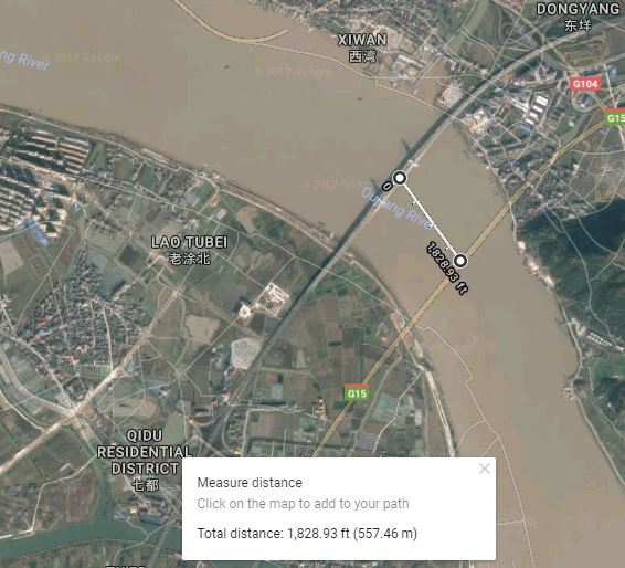
For the field test, my colleague stood at the intersection of two roads and collected two points, as follows:
Point #1: 32°05’03.89”N, 118°54’54.02”E, or 32.084414, 118.915006
Point #2: 32°05’02.62”N, 118°55’00.68”E, or 32.084061, 118.916856
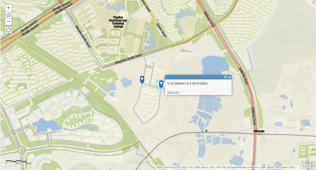
I first mapped these points in ArcGIS Online. In ArcGIS Online, the two points above aligned well with the default imagery base in ArcGIS Online, with the Open Street Map layer, and with the world streets layer, as shown below and on the map shared here.
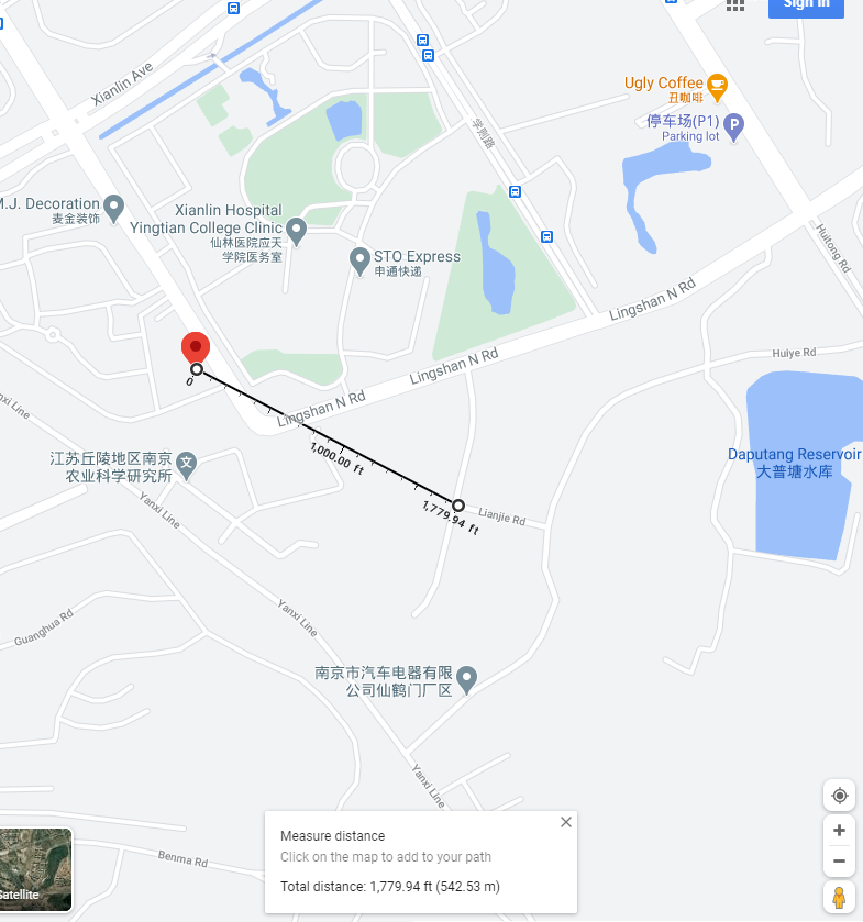
However, when mapped in Google Maps, the following observations were noted: Point 1’s location on the street map is about 1,779.94 feet or 542.53 meters northwest of where my colleague was standing, according to the map.
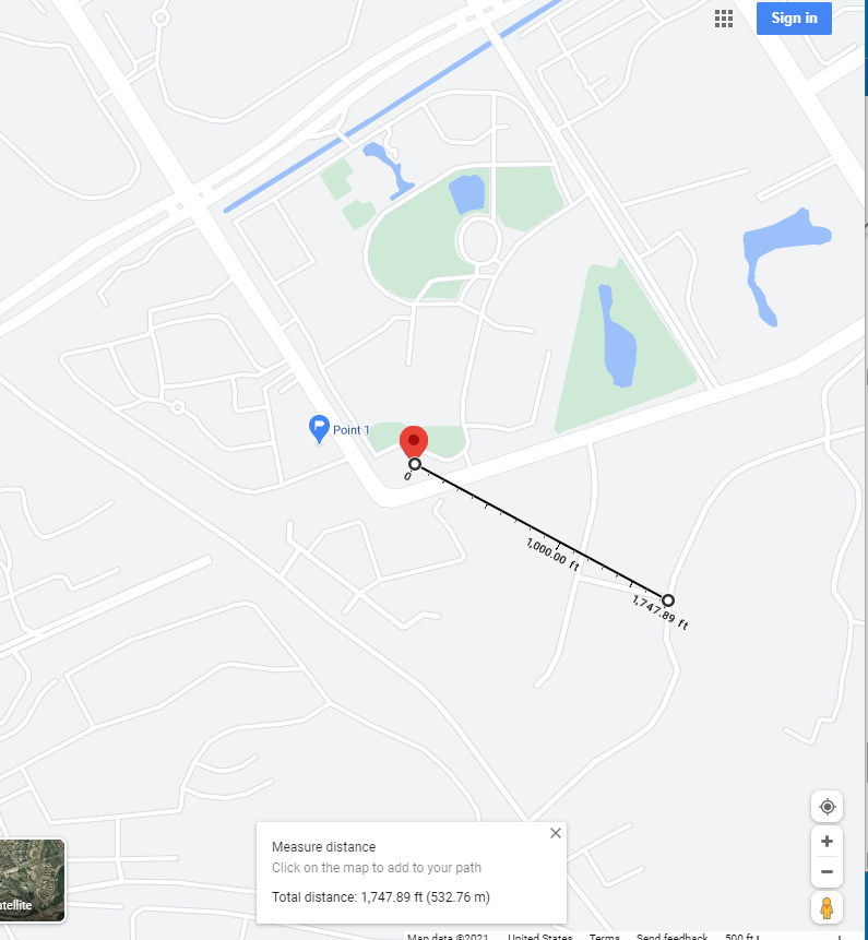
Point 2’s location on the street map is about 1,747.89 feet or 532.76 meters northwest of where my colleague was standing, according to the map.
However, the imagery base map in Google matches well with the actual testing sites. The positions, therefore, are “offset” from the streets layer. I also tested Bing Maps and MapQuest maps; results are below.


Therefore, (1) different streets and imagery layers are either offset or not offset, depending on the layer(s) used; (2) On Google maps, the offset seems to be in this location the same amount (about 532 meters) and in the same direction (northwest) from the imagery to the streets layer, which was the same distance and direction noted a few years ago; (3) these mapping services change over time and are likely to change in the future.
But let’s not be too hasty to assume that the satellite imagery is correct, either. One cannot assume that the satellite images here, or anywhere, are spatially the most accurate layers available. They often are the most spatially accurate, and they are extremely useful to be sure. However, satellite images are processed tiled data sets, and like other data sets, they need to be critically scrutinized as well. First, they should not be considered “reality” despite their appearance of being the “actual” Earth’s surface. They too contain error, may have been taken on different dates or seasons (as we wrote about here), may be reprojected on a different datum; and other issues could also come into play. Second, as you will note just south of the study area, the default satellite imagery is of different dates in ArcGIS Online and Google Maps, with the latter showing (as of the time this essay was being written) a major east-west street being constructed just south of the study area.
Another difference between these maps is a modest amount of variation in the amount of detail in terms of the streets data in China (or anywhere else). The OpenStreetMap is sometimes the most complete, though not always; the other web mapping platforms offered a varying level of detail. The imagery in each platform is compiled and mosaicked from a variety of sources and reflects different dates of acquisition and sometimes different spatial resolution as well.
It all comes back to identifying your end goals in using any sort of GIS. Being critical of the data can and should be part of the decision making process that you use and the choice of tools and maps to use. By the time you read this, the image offset problem may be a thing of the past. But at the time that you are reading this, are there new issues of concern? Data sources, methods, and quality vary considerably among different countries, platforms, and services. Thus, being critical of the data is not just something to practice one time, but rather, fundamental to everyday work with GIS.
We look forward to your comments below.
–Joseph Kerski
Everyday examples of being critical of the data
Each day presents new examples of the central theme of this blog–the importance of being critical of the data, including spatial data. Some of the most effective examples are those rather odd bits of geospatial information, and I have included some of my recent favorites here. These examples are intriguing; some are even fun. They might serve as attention-getting images as you teach students or colleagues about data quality on maps, visualizations, and other forms of communication. If a picture is worth 1,000 words, I say that a map or image is worth 1,000 pictures.
At first glance, from the following result from a phone map search, George Mason University has become a simple Chinese fast-food chain! It begs the question: Is the 4-star rating reflective of the university or of the chicken chow mein?

See this example below from a catalog that I have treasured for a few years. Map orientation matters! This speaks to one of the central goals of my entire career, which is to do all I can to increase geographic literacy. We still have a long way to go! In fairness to this catalog, though, this image has been corrected after I and a few colleagues wrote to them.

Check out the satellite image below. You have heard of life imitating art and vice versa. Is this a case of maps imitating the Earth, or vice versa? I followed the advice we promote in this blog; i.e., I checked several other sources, and it does appear that the pushpin-looking feature in California is legitimate! Notice the dry pushpin-like feature facing the one that contains what appears to be water, and the boat on the desert sands to the southwest of the water feature. The Esri Wayback imagery shows the feature under construction from a image dated February 2014. Still, it is a puzzle what the purpose of a water feature in the middle of the desert is.

“What’s wrong with this picture?” My recent search to fill out a proper bibliographic citation for an article I wrote for the location of the National Academy of Sciences headquarters netted me a location on a house on a cul-de-sac in suburban Denver. How can that be? Could it perhaps be because I was doing the search from a computer in the Denver area?

This errant weather feed below existed online for nearly a year before it was corrected. I know it gets hot in Texas, but really! If the heat doesn’t do you in, the rainfall deluge, impossibly high humidity, and the ferocious winds will!

But even outside of maps, examples are just as numerous. Take a careful look at the Beatles tunes listed below. Funny, I’ve never heard the songs “Penny Lance”, “A Day in the Sky”, or “Can’s Buy Me Love” before! In addition, this isn’t an “album” at all, but rather a user-created playlist but appears on a host of music-related websites.

Feel free to share some additional examples that you have found in the comments section below!
Teaching about spatial data quality
It is important to be critical of data, including, and perhaps especially, spatial data. I frequently receive inquiries from professors seeking resources on the best resources to teach about data quality and foster related discussions with students. Here is one of my recent responses to such an inquiry.
- If you need a fun and engaging set of maps and discussion, use my presentation on Good Maps, Bad Maps, and why it all matters: https://sway.office.com/HqKUCu2ib60rkijh?ref=Link. Scroll down to 30% of the way down in this presentation, in the “Maps Tend to Believed” section. Here you will see a whole set of BAD MAPS. They are misleading, erroneous, or just plain bad for many different reasons – the projection is unsuitable, the data is questionable or impossible (for example, I know it gets hot in Texas but there is a temperature reading from a data feed that is over 3,000 degrees as one example), the legend is misleading, places are blatantly shown in the wrong location, or some other reason.
- A short reading on the above topic, why data quality still matters now more than ever: https://spatialreserves.wordpress.com/2017/12/04/why-data-quality-still-matters-now-more-than-ever/
- More food for thought, presented as the “best available data” “BAD data”: https://spatialreserves.wordpress.com/2017/08/14/best-available-data-bad-data/
- A guide for deciding which data will be useful for your needs: https://spatialreserves.wordpress.com/2018/11/26/a-graphical-aid-in-deciding-whether-geospatial-data-can-be-used/
- An essay reflecting on the 30 checks for data errors: https://spatialreserves.wordpress.com/2015/03/22/gis-gigo-garbage-in-garbage-out-30-checks-for-data-errors/
I hope these resources will be useful to many!

Data quality is a major theme of this blog.
–Joseph Kerski
Be critical of the data even in a time of crisis
The article that recently appeared about the discrepancies in COVID-19 cases and tests fits squarely into the theme of our book and this blog. I invite you to read or skim the article, but just in case the article is no longer available by the time you read this essay, or you would just like a synopsis, it is essentially about this: Some discrepancies about the same data on the same date existed between two data sources. To the readers of this blog and to users of GIS, this is not unexpected: The geospatial data community is trained to examine multiple sources when mapping and making decisions, and collectively, the community has probably encountered this same situation on a weekly if not a daily basis.
Why did the situation in the recent article merit attention? In this case, it was about COVID-19 cases and testing, already a topic intertwined with many emotions, and for good reason. But another reason is that high ranking government officials were quoting one website, Worldometer, and other sources were quoting and using Johns Hopkins University’s site, and others. Why were there differences in the data among the sites?
I have used sites like Worldometer that contain little metadata at times for teaching purposes, but obviously with caution. Worldometer’s population “clock” or “gauge” style of presenting data on world population, for example, makes for compelling teaching, as the population ticks up by several people every second, lending a sense of urgency that can frame discussions about the need for effective planning for agriculture, transportation, water, energy, and other aspects of society. But again, I always use these sites with a wary eye.
The difficulty of discovering how the Worldometer COVID-19 data was derived is the focus of this article. The article’s “sleuthing” style, even going so far to determine the author(s) of the organization behind the data sites, makes for, in my view, interesting and important reading for students or anyone who is working in GIS or data science.
My key takeaways from this story are: (1) As we rely increasingly on real-time and near-real time data feeds, whether about health, or flood stage, or wildfire perimeters, or any other data that is used to make daily decisions, and (2) as the data is increasingly being shared and reported on almost instantly to millions of people, it is more important than ever to understand the source, scale, date, attributes, and other characteristics of the data.
Perhaps the title of this essay needs to be changed from “Be critical of the data even at a time of crisis” to “Be critical of the data especially at a time of crisis”. But I would take it a step farther: “Be critical of the data even when there is no crisis!”
–Joseph Kerski
Creating fake data on web mapping services
Aligned with our theme of this blog of “be critical of the data,” consider the following recent fascinating story: An artist wheeled 99 smartphones around in a wagon to create fake traffic jams on Google Maps. An artist pulled 99 smartphones around Berlin in a little red wagon, in order to track how the phones affected Google Maps’ traffic interface. On each phone, he called up the Google Map interface. As we discuss in our book, traffic and other real-time layers depend in large part on data contributed to by the citizen science network; ordinary people who are contributing data to the cloud, and in this and other cases, not intentionally. Wherever the phones traveled, Google Maps for a while showed a traffic jam, displaying a red line and routing users around the area.
It wasn’t difficult to do, and it shows several things; (1) that the Google Maps traffic layer (in this case) was doing what it was supposed to do, reflecting what it perceived as true local conditions; (2) that it may be sometimes easy to create fake data using web mapping tools; hence, be critical of data, including maps, as we have been stating on this blog for 8 years; (3) the IoT includes people, and at 7.5 billion strong, people have a great influence over the sensor network and the Internet of Things.
The URL of his amusing video showing him toting the red wagon around is here, and the full URL of the story is below:
https://www.businessinsider.com/google-maps-traffic-jam-99-smartphones-wagon-2020-2
I just wonder how he was able to obtain permission from 99 people to use their smartphones. Or did he buy 99 photos on sale somewhere?
–Joseph Kerski
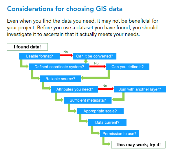
A graphical aid in deciding whether geospatial data meets your needs
The following graphic from an Esri course may be helpful when you are deciding whether or not you should use a specific GIS data set in your analysis. Though simple, it contains several key elements in deciding fitness for use, a key topic in our blog and book, including metadata, scale, and currency.
Another helpful graphic and essay I have found helpful is Nathan Heazlewood’s 30 checks for data errors. Another dated though useful set of text and graphic is from the people at PBCGIS here, where they review the process from abstraction of a situation of a problem, to considering the data model, fitness of data, understanding information needs, and examining the dichotomies of concise vs. confusing, credible vs. unfounded, and useful vs. not useful. PBCGIS created a more detailed and useful set of considerations here. My article published in Directions Magazine about search strategies might also be helpful.
Do you use graphical aids when making decisions about data, or when teaching this topic to others? If so, which are the most useful for you?
Electrical Lines Geospatial Data
I recently created a GIS-based lesson focused on performing a site suitability analysis for wind turbines for the purposes of strengthening GIS skills as well as a demonstration for why GIS actually matters. The geospatial data I used in this lesson includes wind power data from the National Renewable Energy Lab, population data from the US Census Bureau, and other data layers, including electrical lines data. Wait, electrical lines? Yes. The electric lines or grid was, along with other utility-related data, the most difficult data set to gather. This is due to reasons of security (including the passage of the post-9-11 Critical Energy Infrastructure (CEII) Act https://www.ferc.gov/legal/ceii-foia/ceii.asp) and the fact that this data is largely generated and maintained by private companies. Making up my own electrical data for the purpose of this learning activity would have been OK, but I wanted to use real data for the entire lesson. The breakthrough came courtesy of the company S&P Global Platts, who generously gave me some generalized data for Colorado that I used in this lesson.
A colleague of mine pointed out that a more updated and lower voltage (below 69 kV) data is available from the U.S. Department of Homeland Security (DOHS) publicly available Homeland Foundation-Level Data (HFLD), which includes transmission lines: https://hifld-geoplatform.opendata.arcgis.com/. I therefore decided to investigate this resource. It is indeed easy to use, with many options to view and download, with a wide variety of data sets.
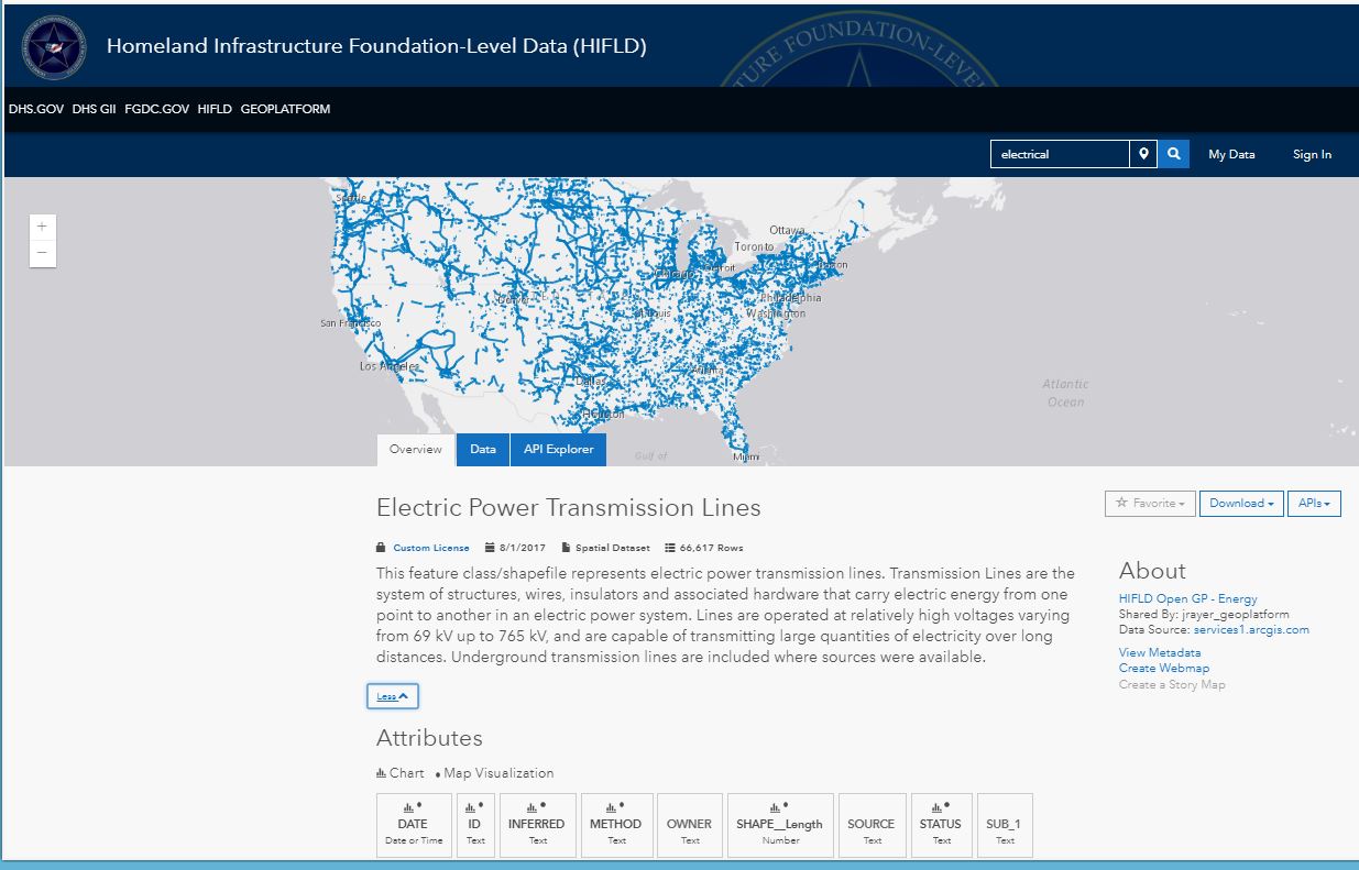
Homeland Foundation-Level Data (HFLD) interface after searching for electrical lines data.
On the subject of data, let’s talk briefly about the wind power data I am using in the lesson. It was developed by AWS Truepower https://www.awstruepower.com/ and validated by the NREL Wind Resource Assessment (WRA) team in 2003; hence, the data I am using is over 15 years old. One might say, “yes, but does wind change that much over time?”, which is a valid argument, but one should also ask, “What were the inputs to this wind data?” The quality of this 50 m data was quite good for its time as the NREL analysts had access to about 6,000 ground measurement sites across the USA with wind measurement data, and their validations put about 80% of the modeled grid cell values within the ground measurement point values. They made heavy use of Grid focal functions to process the data. Fifteen years later, 80 m and 100 m data from AWS Truepower has now been generated, which can be seen on the U.S. Department of Energy (DOE) WINDExchange website https://windexchange.energy.gov/maps-data . But, due to differences in the contractual relationship between NREL/DOE and AWS Truepower, the 80 and 100 m data is not available to the public for free.
Another set of infrastructure data can be found via the U.S. Energy Information Administration (EIA) https://www.eia.gov/ and the U.S. Energy Mapping System https://www.eia.gov/state/maps.php. Biodiesel, coal fields, pipelines, and much more can be obtained via https://www.eia.gov/maps/layer_info-m.php.
Several key takeaways, I think, arise from this discussion: (1) As we pointed out in this public health related essay, sometimes the only way of obtaining the sort of “deeper metadata” that I describe above is to have an old-fashioned phone call, Skype, or email exchange with those responsible for creating the data. This deeper metadata is often not found in typical metadata documents. (2) The results of your geospatial analysis is highly dependent on the quality of the data (its resolution, scale, date, processes used, and so on) that goes into it. Even in my educational activity, the results will be different if different wind power data or different electrical data are used.
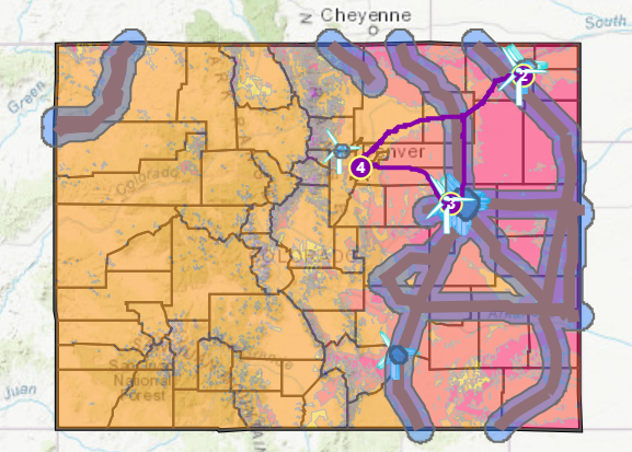
Map from my wind farm site selection activity described in this essay.

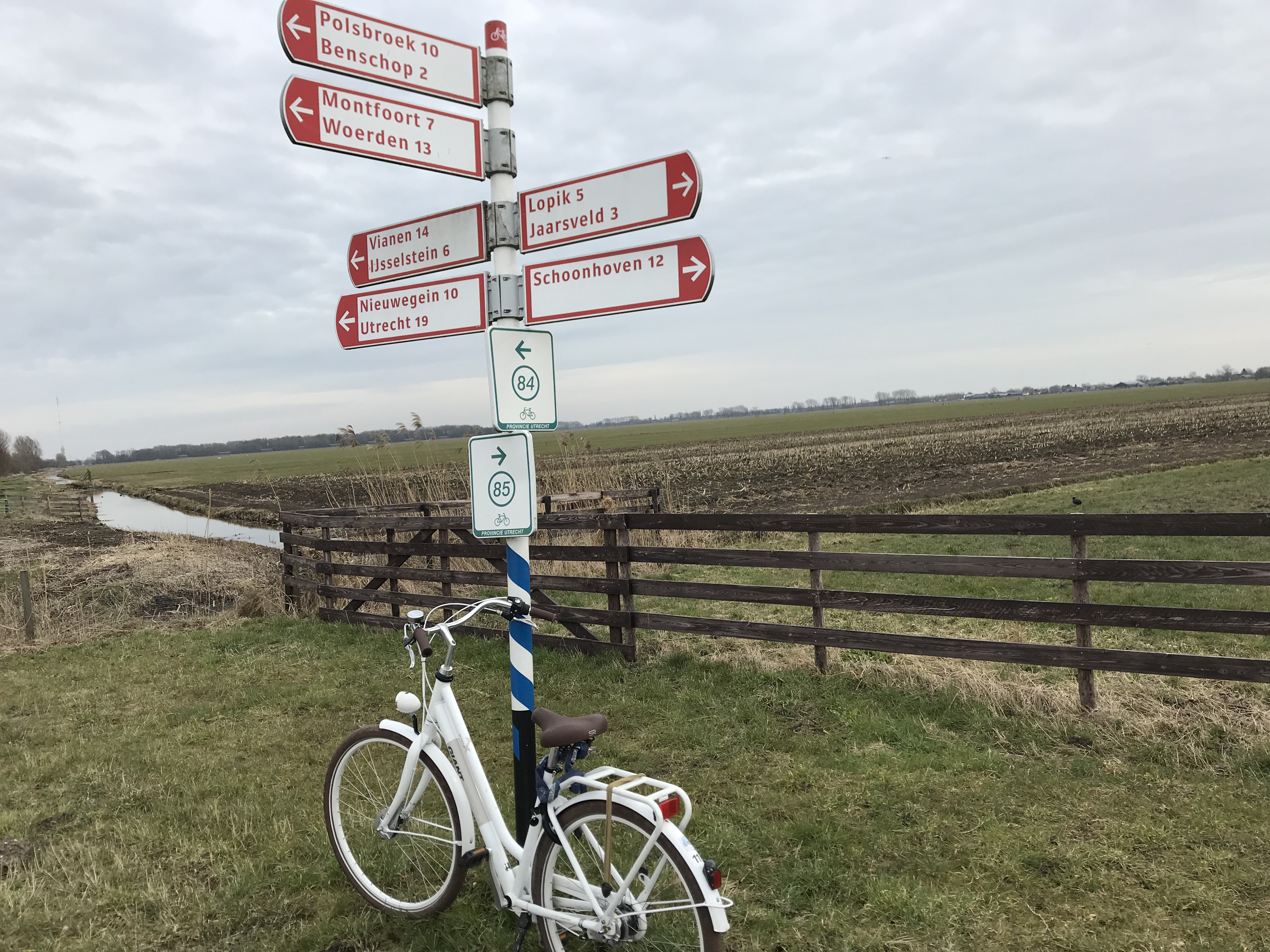
Electrical infrastructure. Photograph in The Netherlands by Joseph Kerski.
On Reputation and Geospatial Information
An interesting article appeared this year entitled “Say goodbye to the information age, it’s all about reputation now” in which Gloria Origgi , philosopher and senior researcher, states that “We are experiencing a fundamental paradigm shift in our relationship to knowledge. From the ‘information age’, we are moving towards the ‘reputation age’, in which information will have value only if it is already filtered, evaluated and commented upon by others. Seen in this light, reputation has become a central pillar of collective intelligence today.”
This observation struck me as in some ways obvious–we are increasingly being asked, and increasingly volunteer, our opinions on everything from what we’ve purchased to where we ate out last to our last airline flight. And we increasingly base our own decisions on how a product or service is evaluated by others. It is my observation that this deluge in surveys and opinion polls makes it more challenging for those of us in the research community to get responses for our own surveys.
But more importantly, in the GIS world, reputation is becoming another part of metadata, influencing our decision whether or not, and how, to use a particular data item. Does the number of “views” that a certain data item has had in a web GIS platform such as ArcGIS Online influence your decision? Should it? Along these lines, Gloria goes on to say that “Whenever we are at the point of accepting or rejecting new information, we should ask ourselves: Where does it come from? Does the source have a good reputation? Who are the authorities who believe it? What are my reasons for deferring to these authorities?” I regularly encourage my students and colleagues to pay attention to the profile, or identification, of a data producer in ArcGIS Online or in any cloud based, crowd-sourced library. If a data set looks rigorous and complete, but the author has not even bothered to change the “head and shoulders” outline or to populate the least bit of information about themselves, it casts doubt on whether I should trust that data set.
But Gloria’s observation also struck me as somewhat disturbing, because it touches on some core themes that we have been writing about in this blog for many years now: How can we trust a geospatial data set, particularly in our web-based GIS environment? In the days of “authoritative sources only”, when all we had to choose from was TIGER, Landsat, EOSAT, DLG, Land Use Land Cover, DEMs, digital orthophotos, and some other core data sets from mapping and statistical agencies, we still needed to evaluate data sources, lineage, quality, scale, date, methods, and other attributes, but making decisions has become more complex with modern web-based GIS libraries. The reason is partly because we have much more data at our fingertips, much of it being crowdsourced. But the situation is more complex I believe because the expectation that data searching should be easy nowadays, because there is “so much out there,” and consequently, analysts feel pressure to keep the data access and manipulation part of a GIS project as short as possible, with perhaps too little attention on wise choices about data.
Another reason this makes me uneasy is, what happens if we are only paying attention to who likes a data set or who has viewed a data set, and paying less attention to other measures? Just because a song is popular does not mean it is “good” according to one’s own measure of music quality. And just because a data set is popular does not mean it is the best representation of a phenomenon one is seeking to understand. A less popular data set might be the most suitable.
What are your reactions to the impact that reputation and popularity are having or could have on the field of GIS?
Decisions, decisions… To what extent do we or should we use reputation and popularity in our choices of data to use?
Why Data Quality Still Matters, Now More than Ever
In my presentation, Why Data Quality Still Matters, Now More Than Ever, (that I created in Microsoft Sway–give it a try sometime!), I point out that while data quality impacts the quality of your maps, there is an even more important concern: You are responsible for ethical, wise decision making, no matter what role or job you have. Data quality affects your decisions and those around you. In the presentation, I provide information about data quality standards, past and present. But my goal is to extend the things that I and Jill Clark have writing in this blog and in our book, and help people to remember “best practices” while on the job working with data and tools, day by day.
I believe that geospatial technologies are often and rightly described as “powerful.” With power comes the ability to cause harm – intentionally or unintentionally – as well as to do good. In the context of GIS, practical ethics is the set of knowledge, skills and abilities needed to make reasoned decisions in light of the risks posed by geospatial technologies and methods in a wide variety of use cases. I believe there are 7 key reasons why data quality still matters in this age of ubiquitous maps and data:
- Maps tend to be believed. They still have the air of authenticity, even in this age when just about anyone can create a map, and with the spread of crowdsourcing. In their recent blog in The Map Room, the authors state that bad maps (such as “favorite food in each state” – really? Says who?) generate lots of web traffic, which is the chief reason they are created. I have included many bad map examples in my presentation that I hope help people think carefully about maps as powerful tools that can lead–or mislead.
- Maps are easy to make. We frequently discuss the advent of web GIS in this blog including the ability to quickly make maps in ArcGIS Online, for example. I love this development, and wouldn’t want to go back to the challenging early days of GIS for anything. But with ease of creation, shortcuts can be taken, and data may not be verified in someone’s haste in easily creating a map.
- Maps are often attached to “fun” online posts. I’m not trying to be Mr Grumpy Pants here, and some of these posts are truly funny and interesting. But the danger with these posts is that it often reinforces point #1 above. I include the example of the supposed voyage of the SS Warrimoo in 1899 in many data quality presentations I give.
- Maps are not reality, but only representations of reality. Useful ones, to be sure, but they are still representations. One example I give in the presentation is the deciduous-coniferous tree line. Is it really a line?
- Be critical of the data–even when it is your own! Even when YOU generated it. My example in the presentation is a GPS track that I collected and mapped.
- Thoroughly check your data sources when you are using them. This often requires extra homework, some hearkening back to “old school” methods of actually -gasp – calling the data creator on the phone. See my example of mapping Lyme disease in Rhode Island.
- Scale still matters. When you zoom in, the accuracy does not increase as you zoom in. Sounds crazy, but I get the distinct impression from many people that they think that because you can view the data at 1:1000 scale, that the data are spatially accurate to that scale. See my example of “walking on water” on a pier on Lake Michigan to drive home this point.
This presentation is the result of expanded research I did after Jill Clark and I wrote about this topic in our book, and after I wrote about this topic in Directions Magazine, here. I look forward to hearing your reactions to the points I raise in this presentation.
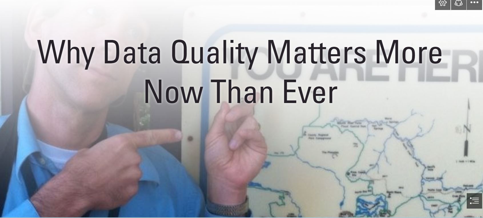 My presentation available online, Why Data Quality Matters More Now Than Ever.
Best Available Data: “BAD” Data?
You may have heard the phrase that the “Best Available Data” is sometimes “BAD” Data. Why? As the acronym implies, BAD data is often used “just because it is right at your fingertips,” and is often of lower quality than the data that could be obtained with more time, planning, and effort. We have made the case in our book and in this blog for 5 years now that data quality actually matters, not just as a theoretical concept, but in day to day decision-making. Data quality is particularly important in the field of GIS, where so many decisions are made based on analyzing mapped information.
All of this daily-used information hinges on the quality of the original data. Compounding the issue is that the temptation to settle for the easily obtained grows as the web GIS paradigm, with its ease of use and plethora of data sets, makes it easier and easier to quickly add data layers and be off on your way. To be sure, there are times when the easily obtained is also of acceptable or even high quality. Judging whether it is acceptable depends on the data user and that user’s needs and goals; “fitness for use.”
One intriguing and important resource in determining the quality of your data can be found in The Bad Data Handbook, published by O’Reilly Media, by Q. Ethan McCallum and 18 contributing authors. They wrote about their experiences, their methods and their successes and challenges in dealing with datasets that are “bad” in some key ways. The resulting 19 chapters and 250-ish pages may make you want to put this on your “would love to but don’t have time” pile, but I urge you to consider reading it. The book is written in an engaging manner; many parts are even funny, evident in phrases such as, “When Databases attack” and “Is It Just Me or Does This Data Smell Funny?”
Despite the lively and often humorous approach, there is much practical wisdom here. For example, many of us in the GIS field can relate to being somewhat perfectionist, so the chapter on, “Don’t Let the Perfect be the Enemy of the Good” is quite pertinent. In another example, the authors provide a helpful “Four Cs of Data Quality Analysis.” These include:
1. Complete: Is everything here that’s supposed to be here?
2. Coherent: Does all of the data “add up?”
3. Correct: Are these, in fact, the right values?
4. aCcountable: Can we trace the data?
Unix administrator Sandra Henry-Stocker wrote a review of the book here, An online version of the book is here, from it-ebooks.info, but in keeping with the themes of this blog, you might wish to make sure that it is fair to the author that you read it from this site rather than purchasing the book. I think that purchasing the book would be well worth the investment. Don’t let the 2012 publication date, the fact that it is not GIS-focused per se, and the frequent inclusion of code put you off; this really is essential reading–or at least skimming–for all who are in the field of geotechnology.
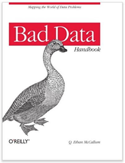
Bad Data book by Q. Ethan McCallum and others.
Contributors
Gallery


Recent Comments