Archive
Tips on Serving Geospatial Data
My colleague at Esri Canada wrote a very useful essay containing 9 tips to ensure high quality open data downloads. This includes how to organize and publish your data services, paying attention to the number of features, titles, and data descriptions, fields and field names, showing and hiding fields, tags, licensing information, thumbnails, and metadata. As such, the essay is germane to the focus of this geospatial data blog. The article focuses on the ArcGIS platform but applies throughout the GIS professional community as a set of sound principles.

In addition, this set of workshop slides from Esri provides additional information on practices, plus one that is not in the above essay, having to do with simplifying data if your data is dense with vertices: ArcGIS Hub- Open Data Best Practices (esri.com).
In addition to the above resources, this topic presents a good opportunity to remind the reader about the following guidelines:
- How to manage metadata in ArcGIS Online: https://doc.arcgis.com/en/arcgis-online/manage-data/metadata.htm
- The ArcGIS metadata format:
https://desktop.arcgis.com/en/arcmap/latest/manage-data/metadata/the-arcgis-metadata-format.htm# - Updating metadata to ArcGIS Pro: https://pro.arcgis.com/en/pro-app/latest/help/metadata/upgrade-metadata-to-the-arcgis-format.htm
I hope this is helpful and I look forward to your comments below.
–Joseph Kerski
Prompts and choices to improve data content quality
My colleague Sentha Sivabalan wrote an excellent article about how to improve geospatial data content quality. While the article focuses on tools and approaches to accomplish this in ArcGIS Online, the wisdom Sentha shares here about the need to pay attention to metadata apply to any platform. In ArcGIS Online, new prompts exist that indicate to data content authors when they upload content, about which facets of metadata need improvement. While it is still up to authors to make those improvements beyond the minimum title, tags, and description asked for, I suspect these prompts will, over time, help everyone in the geospatial community better decide whether or not to use that content. It will also help authors be more thoughtful about populating their own metadata. In addition, authors can mark their content as authoritative or deprecated, both of which attributes other users can filter on when they are searching for content.
ArcGIS Online, including the Living Atlas of the World, is a rapidly expanding body of geospatial content. I encourage the reader to investigate both of these when searching for geospatial data and make use of the filters described above.
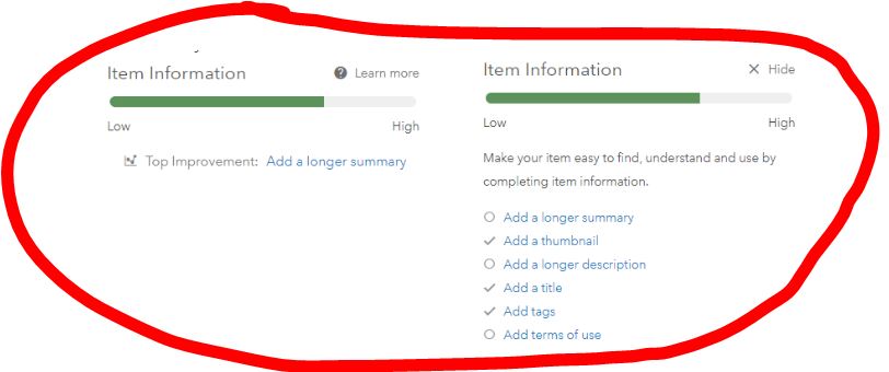
Some of the metadata prompted for in ArcGIS Online.
–Joseph Kerski
Track on Track, Revisited: Spatial Accuracy of Field Data
Back in 2014, I tested the accuracy of smartphone positional accuracy in a small tight area by walking around a track. During a recent visit to teach GIS workshops at Carnegie Mellon University, I decided to re-test, again on a running track. My hypothesis was that triangulation off of wi-fi hotspots, cell phone towers, and the improved GPS constellation would have improved the spatial accuracy of my resulting track over those intervening years.
After an hour of walking, and collecting the track on my smartphone with a fitness app (Runkeeper), I uploaded my track as a GPX file and created a web map showing it in ArcGIS Online. Open this map > use bookmarks > navigate to the Atlanta and Pittsburgh (Carnegie Mellon University) locations (also shown on the graphic below on the left and right, respectively). Once I mapped my data, my hypothesis was confirmed: I kept to the same lane on the running track, and the width of the resulting lines averaged about 5 meters, as opposed to 15 meters on the track from four years ago. True, the 2014 track variability was no doubt in part because I was surrounded by tall buildings on three sides (as you can see in my video that I recorded at the same time) , while the building heights on the Carnegie Mellon campus were much lower. However, you can measure for yourself on the ArcGIS Online map linked above and see the improvement over those two tracks taken just 4 years apart.
I did another test while at Carnegie Mellon University–during my last lap on the track, I moved to the inside lane. This was 5 meters inside the next-to-outer lane where I completed my other laps. I wanted to see whether this shift would be visible on the resulting map. It is! The lane is clearly visible on the map and on the right side of the graphic below, which I labeled as “inside lane.”
To explore further, on the map above, go to > Contents, to the left of the map, and turn on the World Imagery Clarity layer. Then use the Measure tool to determine how close the track is to the satellite imagery (which isn’t perfect either, but see teachable moments link below). You will find that at times the track was 0.5 meters from the image underneath Lane 1, and at other times 3.5 meters away.
Both tracks featured “zingers” – lines stretching away from the actual walking tracks, resulting from points dropped as I exited the nearby buildings and walked outside, as my location based service first got its bearing. But again, an improvement was seen: The initial point was 114 meters off in 2014, but in 2018, only 21.5 meters. In both cases, as I remained outside, the points became more accurate. When you collect data, the more time you spend on the point you are collecting, typically the more spatially accurate that point is.

Comparison of tracks taken with the same application (RunKeeper) on a smartphone four years apart illustrate the improvements in positional accuracy over that time.
To dig deeper into issues of GPS track accuracy and precision, see my related essay on errors and teachable moments in collecting data, and on comparing the accuracy of GPS receivers and smartphones and mapping field collected data in ArcGIS Online here.
Location based services on the smartphone still do not yet deliver the spatial accuracy for laying fiber optic cable or determining differences in closely-spaced headstones in cemeteries (unless a device such as Bad Elf or a survey-grade GPS is used). Articles are appearing that predict spatial accuracy improvements in smartphones. Even today, though, I was quite pleased with my track’s spatial accuracy, particularly in 2018. I was even more pleased considering that I had the phone in my pocket most of the time I was walking. I did this in part because it was cold, and cold temperatures tend to rapidly deplete my cell phone’s battery (which is unfortunate, and the subject of other posts, many of which sport numerous adds, so they are not listed here). Happy field data collection and mapping!
–Joseph Kerski
Finding Data on ArcGIS Hub Open Data Portal
The ArcGIS Hub Open Data Portal has in a short period of time become a very useful means by which geospatial data can be searched, found, and used. I believe that there are two main reasons why: The ArcGIS Hub (1) allows organizations to easily host their own data, and (2) provides an easy to use but powerful set of tools for users to find data. At the time of this writing, nearly 111,000 data sets were linked to the ArcGIS Hub Open Data Portal from nearly 6,000 organizations worldwide.
In keeping with the theme of our book and this blog, pay close attention to each of the data sets listed here that you are interested in using, and make sure you understand the usage restrictions, if any. Not all data sets listed are necessarily “open” for any conceivable use, so again, understand the licensing and usage for your desired data set.
One advantage to using the ArcGIS Hub Open Data Portal from the user’s perspective is its simple layout (Figure 1): The user is presented with a search category box along with a location box; i.e. “near <location x>.” This surprisingly straightforward interface reminds me of how simple I found Google search to be nearly 20 years ago after years of using WebCrawler, AltaVista, and other search engines.
My education outreach team recently used the ArcGIS Hub in an educational context, in our Esri MOOC entitled “Do It Yourself Geo-Apps”. In the MOOC, we had participants leverage open data to build web apps using Washington D.C.’s Vision Zero Safety data to help people learn more about pedestrian and bicyclist safety within the community. Specifically, students in the course searched and found data on commuting in Washington DC, downloaded the data as a shapefile, and uploaded it to their ArcGIS Online account (Figure 2) and began analyzing it.
An alternative workflow becoming rapidly adopted, as we have documented in this blog, rather than download and upload, is to obtain the link for the data as a REST endpoint and add it directly into a working session in ArcGIS Online, from which analysis tools can be run. To do this using the ArcGIS Hub, use the APIs link on the right side after you find your desired data set, with one modification: The GeoService full dataset are often tagged with a query statement. For example, the Michigan hydrography polygons are listed as: https://gisago.mcgi.state.mi.us/arcgis/rest/services/OpenData/hydro/MapServer/17/query?outFields=*&where=1%3D1. To view the data in ArcGIS Online, remove everything after MapServer/, as shown in Figure 3.
Another fascinating feature in that same right-hand zone on the metadata results page is “create story map”, which, as the name implies gets you started right away creating and displaying the data in a story map (Figure 4) – in my case, a map series story map. From this point, you could add additional layers, audio, video, photographs, and narrative to this same story map.
It is understandable with any open portal such as this, with contributions from a wide variety of organizations, that some challenges will exist. From the perspective of the data user, one of those current challenges is finding results to searches on medium sized polygon areas, such as “Colorado” or “Platte River drainage”. However, in the above Washington DC example, even if you did not know the term “Vision Zero”, a search on bicycle safety near Washington DC would provide you the result you are seeking. The data extent for the Washington DC Vision Zero covered the entire North Atlantic Ocean, but that’s no doubt the result of an improperly encoded data point.
There is much more to ArcGIS Hub than this open data portal. ArcGIS Hub includes community engagement tools such as event management, comment management, engagement dashboards, and initiatives. One of the most appealing things about the ArcGIS Hub is that if you have an ArcGIS Online subscription, you can share your own authoritative open data with ArcGIS Hub. By using your existing ArcGIS Online groups to identify data to share, you can set up public-facing websites for people to easily find and download your data in a variety of open formats. Your open datasets are connected to the source and are automatically updated. I highly recommend spending time with the ArcGIS Hub, beginning with the open data portal.

Figure 1. ArcGIS Hub Open Data interface, a very useful tool for finding geospatial data.

Figure 2. Vision Zero safety data for Washington DC from the ArcGIS Hub streamed into ArcGIS Online. 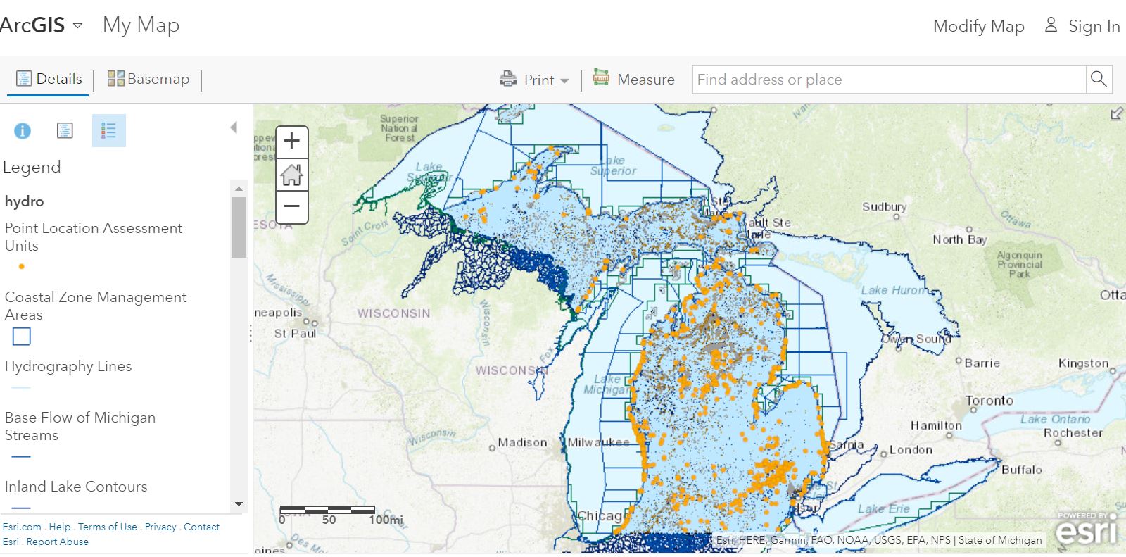
Figure 3. Michigan hydrography data from the ArcGIS Hub streamed into ArcGIS Online.
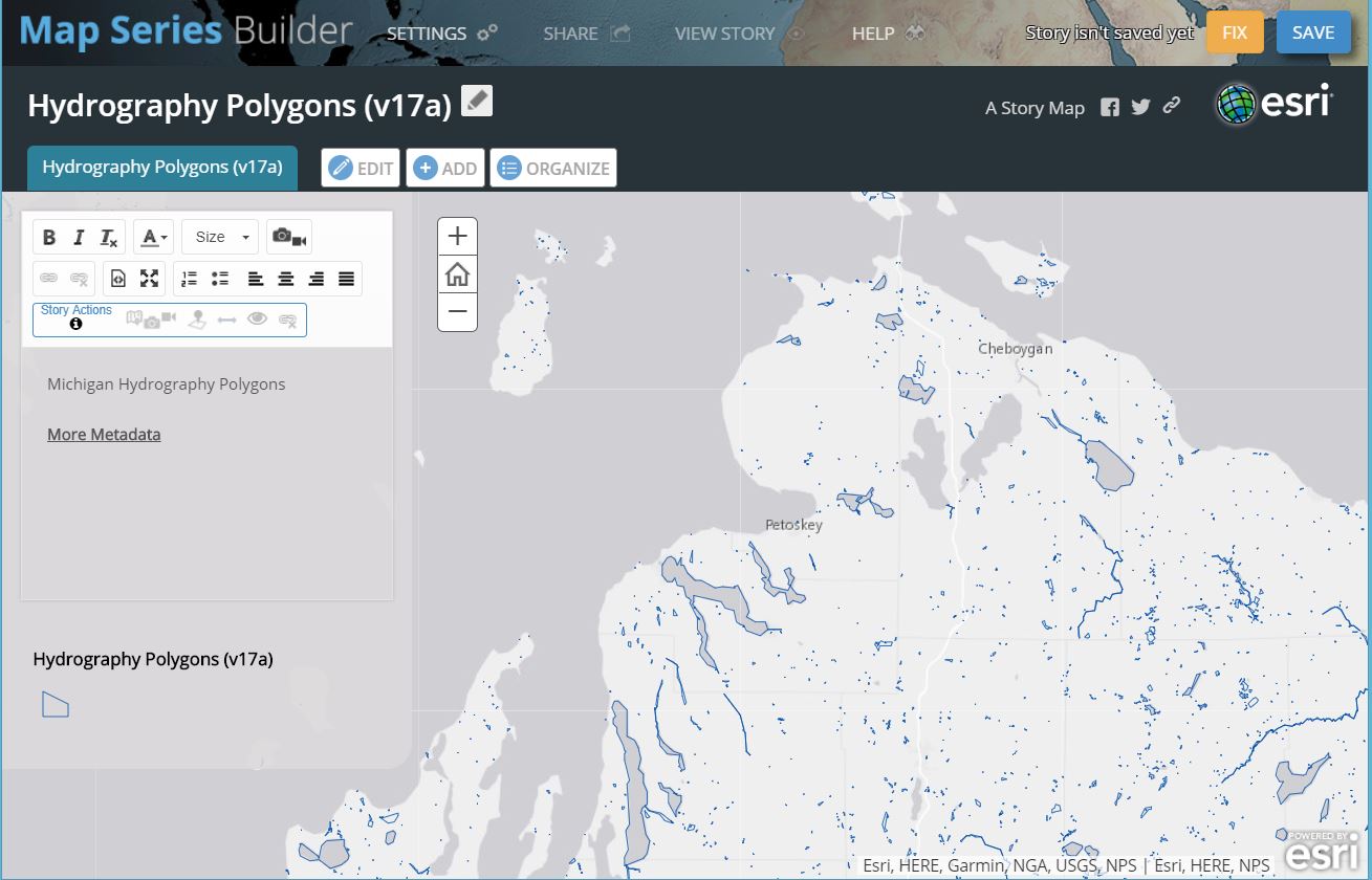
Figure 4. Story map from Michigan hydrography polygons.
Data Quality and Intentional Offsets on Interactive Web Maps
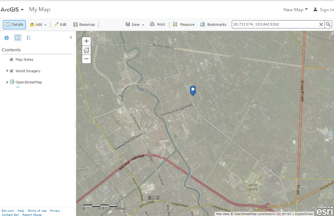
Modern web maps and the cloud-based GIS tools and services upon which they are built continue to improve in richness of content and in data quality. But as we have focused on many times in this blog and in our book, maps are representations of reality. They are extremely useful representations, to be sure, particularly so in the cloud, but still are representations. These representations are dependent upon the data sources, accuracy standards, map projections, completeness, processing and rendering procedures used, regulations and policies in place, and much more. A case in point are offsets between street data and the satellite image data that I noticed in mid-2017 in Chengdu in south-central China. The streets are about 369 meters southeast of where they appear on the satellite image (below):

Puzzled, I panned the map to other locations in China. The offsets varied, but they appeared everywhere in the country; for example, note the offset of 557 meters where a highway crosses the river at Dongyang, again to the southeast:

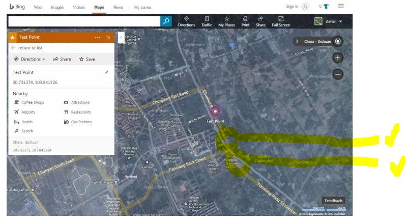
As of this writing, the offset appears in the same cardinal direction and only in China; indeed; After examining border towns with North Korea, Vietnam, and other countries, the offset appears to stop along those borders. No offsets exist in Hong Kong nor in Macao. Yahoo Maps Bing Maps both show the same types of offsets in China (Bing maps example, below):
MapQuest, which uses an OpenStreetMap base, showed no offset. I then tested ArcGIS Online with a satellite image base and the OpenStreetMap base, and there was no offset there, either (below). This offset is a datum issue related to national security that is documented in this Wikipedia article. The same data restriction issues that we discuss in our book and in our blog touch on other aspects of geospatial data, such as fines for unauthorized surveys, lack of geotagging information on many cameras when the GPS chip detects a location within China, and seeming unlawfulness of crowdsourced mapping efforts such as OpenStreetMap.
But furthermore, as we have noted, the satellite images are processed tiled and data sets, and like other data sets, they need to be critically scrutinized as well. They should not be considered “reality” despite their appearance of being the “actual” Earth’s surface. They too contain error, may have been taken on different dates or seasons, may be reprojected on a different datum, and other data quality aspects need to be considered.
Another difference between these maps is the wide variation in the amount of detail in terms of the streets data in China. The OpenStreetMap was the most complete; the other web mapping platforms offered a varying level of detail; some of which were seriously lacking, surprisingly especially in the year 2017, in almost every type of street except major freeways. The streets content was much more complete in other countries.
It all comes back to identifying your end goals in using any sort of GIS or mapping package. Being critical of the data can and should be part of the decision making process that you use and the choice of tools and maps to use. By the time you read this, the image offset problem could have been resolved. Great! But are there now new issues of concern? Data sources, methods, and quality vary considerably among different countries. Furthermore, the tools and data change frequently, along with the processing methods, and being critical of the data is not just something to practice one time, but rather, fundamental to everyday work with GIS.
US Congress: Maps and Data Portals
Did you know that the US Congress is increasing its use of web mapping tools in GIS? In one of these map collections from the US Congress, you can discover organizations who host maps and data. The themes of these maps include business locations, wildfires, hurricanes and current weather, public transportation, education, and many others. For education, these maps could be useful for discussions in political science, geography, biology, business, and in other disciplines, as well as access to data for courses that use GIS. To find out why the US Congress finds value in web mapping and GIS, read the excellent article that my colleague Lauren Lipovic recently wrote about how GIS is increasingly being used to inform and disseminate public policy. Also, see the government policy page from Esri for more case studies, maps, and data.
The Mapping for Congress Featured Set contains some maps on the above themes; the most compelling one in my opinion is the set for Senator Risch from Idaho, on wildland fire potential, brownfields development success stories, and other themes of interest to citizens of that state and to those living elsewhere. Another notable example from the Featured Set collection is this new map of Virginia state parks.
The Federal Agency Map Collection assembled by my colleague provides another excellent way of accessing more of these maps and data sets. This collection includes the Mapping for Congress Expanded Gallery. While some of the maps are applications that do not allow for streaming or downloading the data, GIS users with a bit of digging will find plenty of layers that they can use for analysis. And equally importantly, these data sets represent a trend that we noted in our book–with increasing use of web mapping tools such as Esri story maps and the ability to assemble these map galleries, decision makers are increasing their use of GIS and spatial analysis in their decision making, which is good news for all of us.
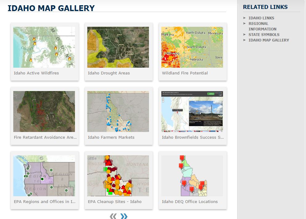
The Idaho Map Gallery.
Landsat Thematic Bands Web Mapping Application in ArcGIS Online
Teaching remote sensing? Or just want to understand remotely sensed imagery better? The Landsat Thematic Bands web mapping application can serve as a very useful teaching, learning, and research tool (June 2020 update: The application is now part of the ArcGIS Living Atlas of the World set of apps). It covers the entire planet and the map is updated daily with new Landsat 8 scenes.
You can access many band combinations and indices by hovering over the tools to the left of the map image and selecting among the following:
- Agriculture: Highlights agriculture in bright green. Bands 6,5,2
- Natural Color: Sharpened with 25m panchromatic band. Bands 4,3,2+8
- Color Infrared: Healthy vegetation is bright red. Bands 5,4,3
- SWIR (Short Wave Infrared): Highlights rock formations. Bands 7,6,4
- Geology: Highlights geologic features. Bands 7,4,2
- Bathymetric: Highlights underwater features. Bands 4,3,1
- Panchromatic: Panchromatic image at 15m. Band 8
- Vegetation Index: Normalized Difference Vegetation Index (NDVI). (Band5-Band4)/(Band5+Band4)
- Moisture Index: Normalized Difference Moisture Index (NDMI). (Band5-Band6)/(Band5+Band6)
The Time tool for different indices at larger scales based on a user-selected location enables examination of changes over years or over seasons. It also provides temporal profiles for NDVI (Normalized Difference Vegetation Index), NDMI (Normalized Difference Moisture Index) and an Urban Index, dating back to 1973. The Identify tool enables access to information on the date, cloud cover, and a spectral profile about each scene. The Bookmark tool allows access to interesting locations such as the “Eye of the Sahara” in Mauritania.
The original application was written using Web AppBuilder for ArcGIS accessing image services using the ArcGIS API for JavaScript, with access to the following Image Services:
- Landsat Multispectral on AWS – 8-band multispectral 30m resolution image services and functions that provide different band combinations and indices.
- Landsat Pan-sharpened on AWS – Panchromatic-sharpened imagery; 4-band (Red, Green, Blue and NIR); 30m resolution.
- Landsat Panchromatic on AWS – Panchromatic imagery; 15m resolution.
These services can also be accessed through the public Landsat on AWS group on ArcGIS Online. Because you can add these services as layers to your own maps or are adding to maps made by others, or if you are simply using the above web mapping application as a standalone map, you truly have “the world at your fingertips” with these maps and apps. But there is a third option: Use the Unlock Earth’s Secrets page, also useful for instruction, with the above application embedded in it, but also with explanatory text and featured places around the planet as they have changed through time.
Think of the above as solid introductory segments to help your students, customers, or stakeholders see the value in remote sensing. These maps and applications require very little geospatial technology skills to use, but allow you to focus on building remote sensing concepts and principles while exploring some truly engaging content and places.
To dig deeper, delve into the many powerful remote sensing functions available in ArcGIS Desktop. One source for engaging, hands-on activities, is Kathryn Keranen and Bob Kolvoord’s book Making Spatial Decisions Using GIS and Remote Sensing: A Workbook.
Give these resources a try!

Landsat web application in ArcGIS Online.
Metadata Enhancements in ArcGIS Online
Geospatial metadata has been described as the language that enables information sharing and discovery. The International Standards Organization (ISO) uses this wording in its “scope” section: “This International Standard provides information about the identification, the extent, the quality, the spatial and temporal schema, spatial reference, and distribution of digital geographic data.” The US Federal Geographic Data Committee (FGDC) defines it as, “A metadata record is a file of information, usually presented as an XML document, which captures the basic characteristics of a data or information resource. It represents the who, what, when, where, why and how of the resource. Geospatial metadata are used to document geographic digital resources such as Geographic Information System (GIS) files, geospatial databases, and earth imagery. A geospatial metadata record includes core library catalog elements such as Title, Abstract, and Publication Data; geographic elements such as Geographic Extent and Projection Information; and database elements such as Attribute Label Definitions and Attribute Domain Values.” In Chapter 5 of our book, we discuss these standards and the importance of metadata in more detail.
ArcGIS desktop software from Esri has for many years supported formats for organizations to attach metadata in a variety of accepted formats. Recently, ArcGIS Online’s support for metadata was enhanced. Metadata in ArcGIS Online has always been created, edited, and viewed in the item details page, but up to now, this has required a manual process, reliant on the person or organization creating the data to input the contents. ArcGIS Online now allows organizations to “enable metadata”, which means that they can include additional standards-based metadata for all item types using a built-in metadata editor. It can be used for web maps, scenes, and web apps. Once enabled, a “metadata” button appears on the detail pages for the owner of that data set and for anyone with access to view the data, they too see a metadata button to view that as well.
Any of the following styles can be chosen: FGDC CSDGM Metadata (Content Standard for Digital Geospatial Metadata), the INSPIRE Metadata Directive, according to ISO 19139 standards, ISO 19139 Metadata Implementation Specification GML3.2, identical to the one above, except the exported files use the GML 3.2 namespace, ISO 19139 Metadata Implementation Specification, allowing to view and edit a complete metadata document that complies with ISO standard 19139, and the North American Profile of ISO 19115 2003.
How can you port metadata from ArcGIS desktop to ArcGIS Online? Standards-based metadata for shapefile are stored in an accompanying metadata XML file where the shapefile is stored. To extract the metadata from a file geodatabase, use the geoprocessing XSLT Transformation tool with the exact copy of. the xslt stylesheet to export the metadata content to a stand-alone metadata XML file in the ArcGIS metadata format.
Support for standard metadata content welcome news, and we expect that metadata from ArcGIS Pro will one day soon be supported as well.

Metadata in ArcGIS Online was recently enhanced with standards-based metadata.
The National Geologic Map Database Map Viewer
As we describe in the book The GIS Guide to Public Domain Data, the AASG-USGS National Geologic Map Database (NGMDB), is one of the most useful resources to access geologic maps and data. The NGMDB, through its Geoscience Map Catalog, provides access to more than 89,000 maps and reports by more 630 publishers. More than 23,000 of these publications are geologic maps. A significant leap forward since the book was published is the new NGMDB Map Viewer. This Mapviewer is built using Esri ArcGIS Server and the Image Server Extension. With the viewer, inside ArcGIS Online inside an ordinary web browser, data users can access a significant component of the national archive of the systematic, regional mapping of bedrock and surficial deposits, conducted by Federal, State, University, and private entities, stretching back to the 1800s.
Why access the NGMDB through this map viewer? There are several advantages to doing so: You can view numerous maps in the NGMDB Map Catalog in one seamless interface running in your web browser. You can toggle between selected map types, search by keyword to find a record in the Map Catalog, find related publications, and best of all, access the Map Catalog to download high resolution geotiffs and other GIS-compatible formats. I formerly worked at the USGS, and have been in touch with colleagues there over the past year, eagerly awaiting the arrival of this map viewer. If you have read our book or have been reading this blog, you know that Jill Clark and I cast a rather critical eye on any data portal or viewer, assessing whether any of them are truly useful for the GIS data user. I am pleased to report that after testing the NGMDB Map Viewer, it met all of my expectations. True, the database is largely (but not entirely) US-based, but the interface is easy to use and allows the data users to obtain what they came for–GIS-compatible geologic data of different areas, scales, and themes.
To access the database, go to ArcGIS Online: http://www.arcgis.com/home and search for “USGS NGMDB Map Viewer 2012”, or directly to http://ngmdb.usgs.gov/maps/mapview.

National Geologic Maps Database Viewer in ArcGIS Online
Contributors
Gallery


Recent Comments